Haru Petroleum Gas Station
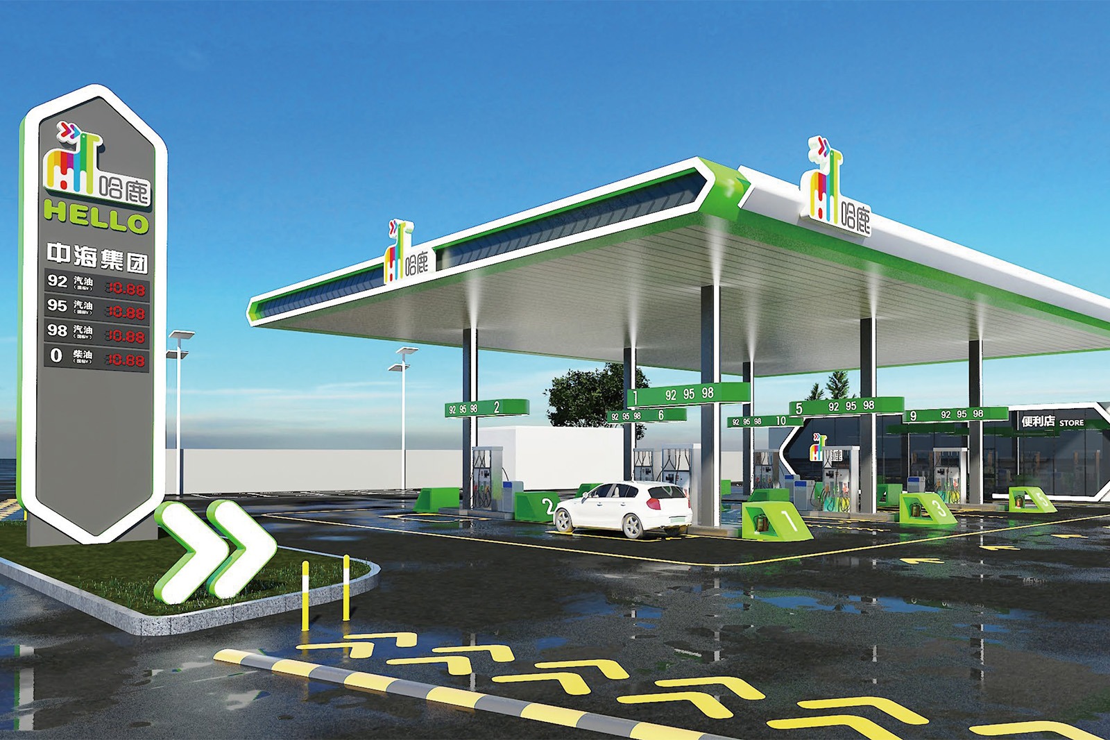
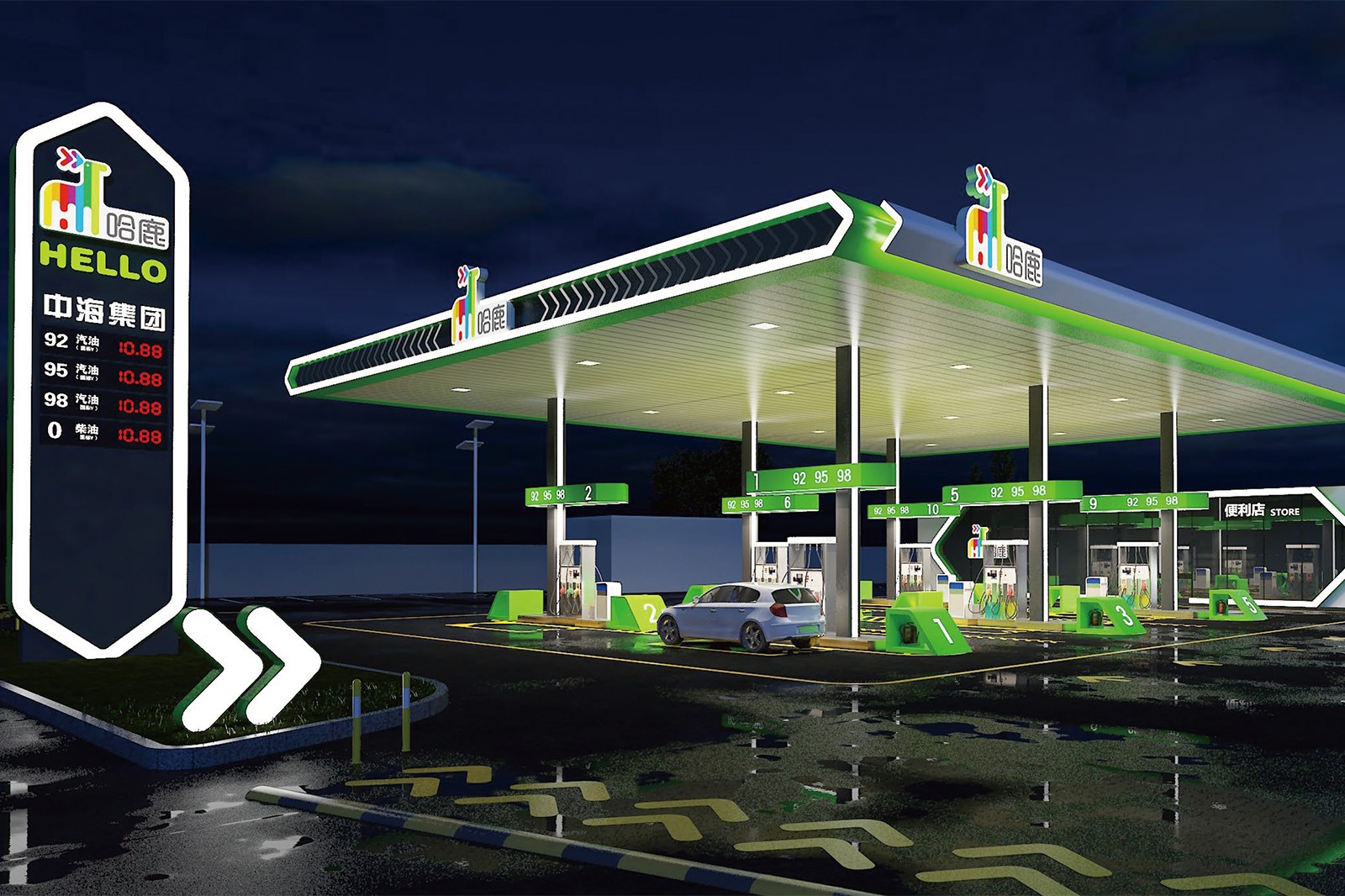
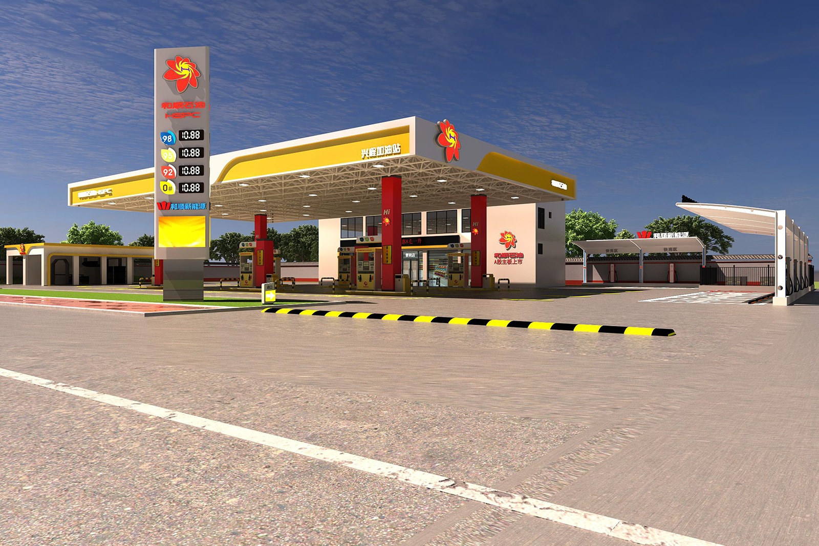
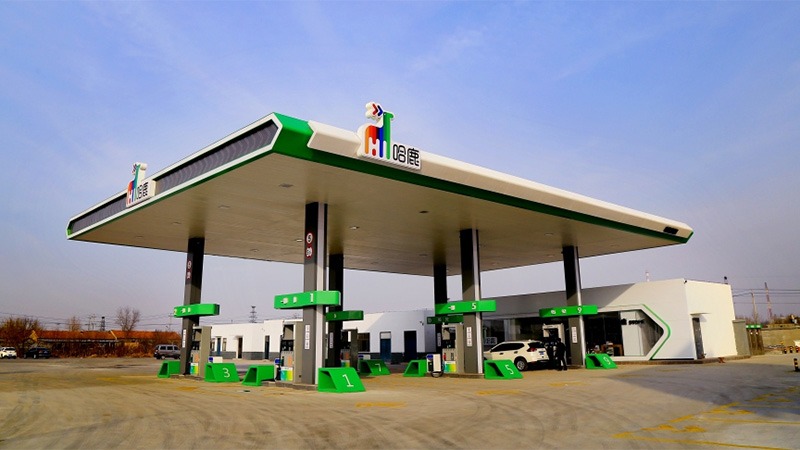
Project Location: Xiabao Village, Lvqiao Town, Huangye City, Cangzhou City, Hebei Province, China
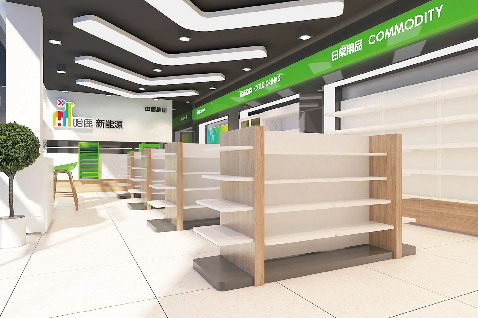
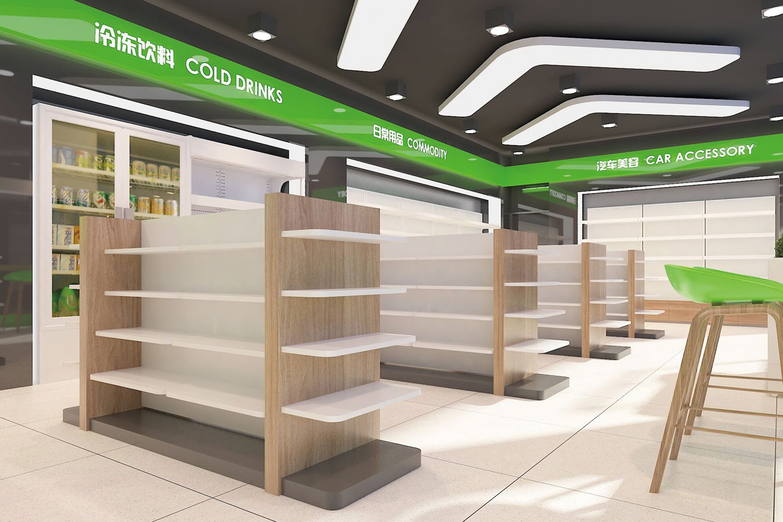
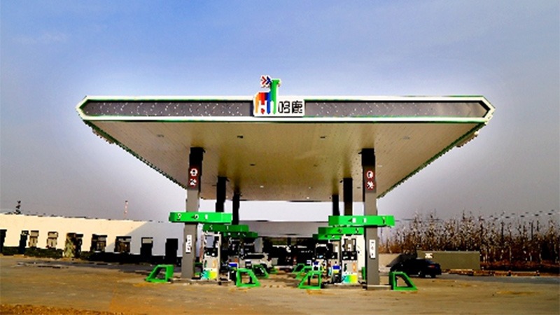
Design color tone: Dark gray + Pure white + green
Project area: 600 ㎡
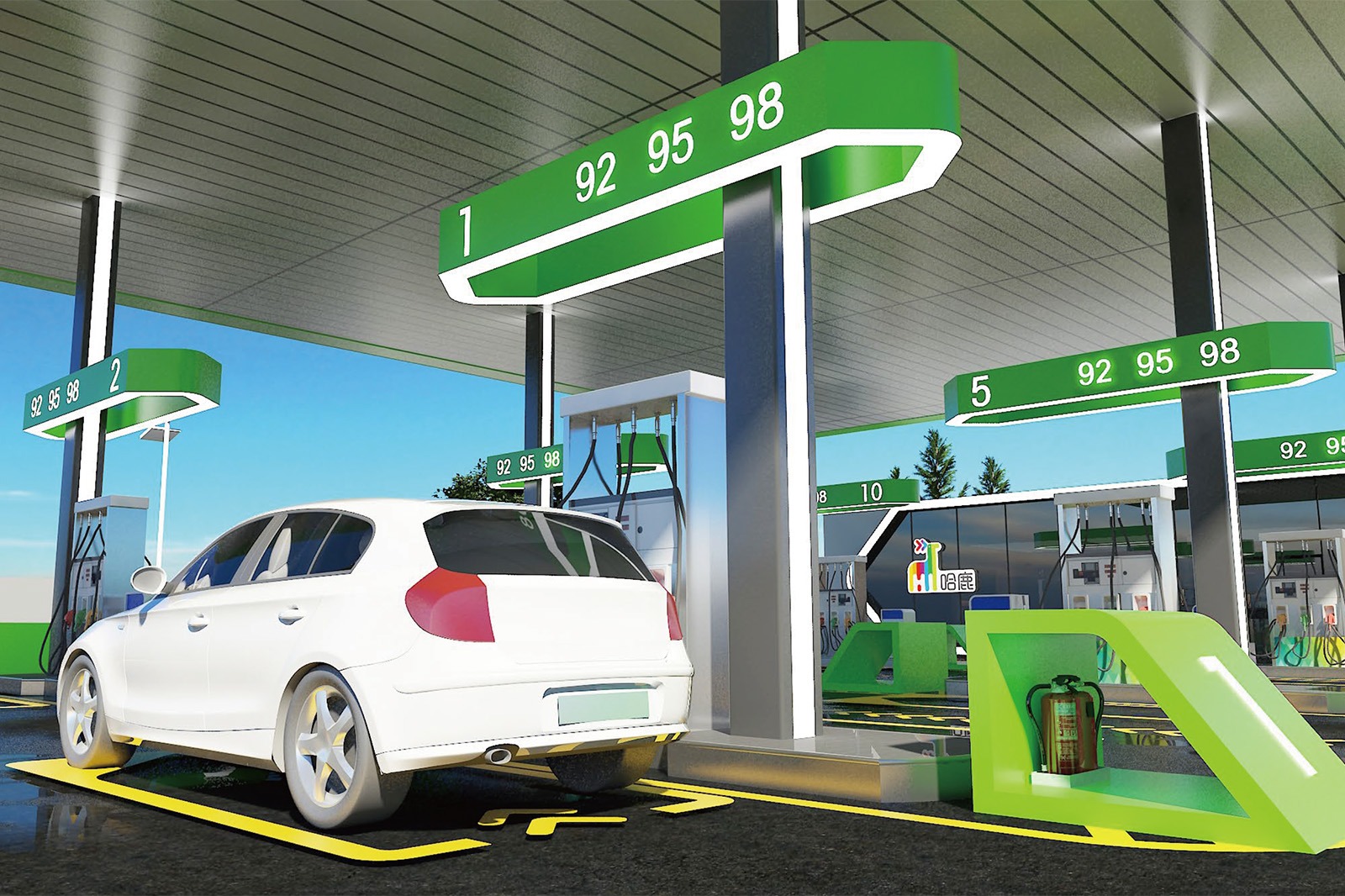
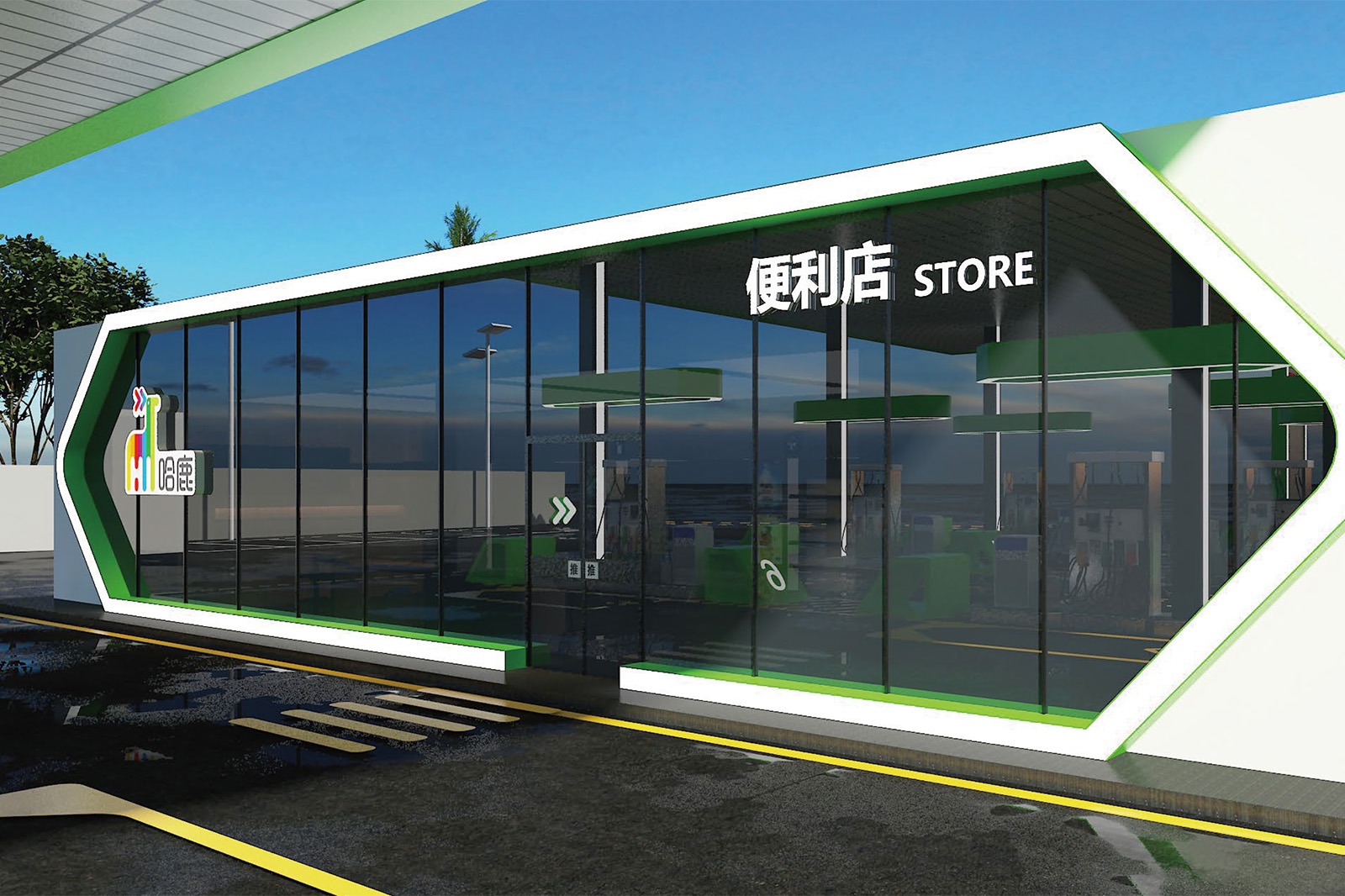
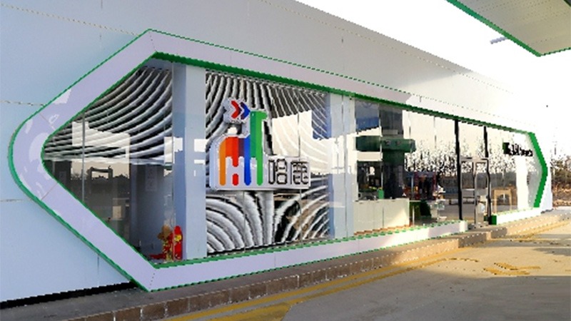
Project Content: pylon sign + canopy singboard+canopy fascia + column wrapping + aluminum buckle ceiling + entrance and exit
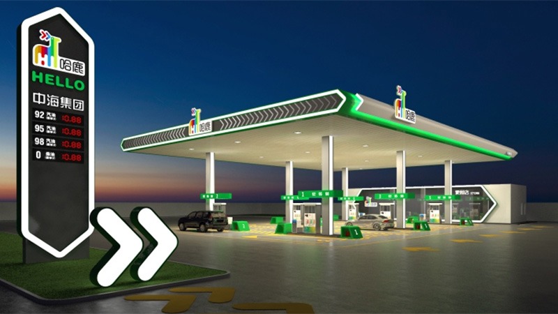
The design concept for the Haru Gas Station is: Deer Singing, Green Roads, Enjoying a Journey
Brand Imagery: A lively deer conveys warm greetings
The brand name “HELLO” uses a friendly greeting, paired with the vibrant image of a deer, to instantly connect with drivers. The deer symbolizes agility, agility, and gentleness, signifying that Haru Petroleum provides drivers with a smooth and effortless refueling experience. The diverse design elements not only add a lively atmosphere to the gas station but also represent the brand’s diverse and rich service philosophy. Just like a deer freely roaming through the forest, Haru Petroleum is committed to adding color to drivers’ travel lives.
Leave Your Message
Flowing Ecological Lines
Cornice
The cornice is outlined with simple, flowing lines, and the green trim resembles a dynamic ribbon, echoing the vibrant DNA of “HELLO.” Its tilted angle interacts with light, directing sunlight into the refueling area during the day, creating a bright and airy feel. At night, the illuminated arrows dynamically extend left and right along the eaves, breaking the dullness of the night. The daytime transparency transforms into a guiding light trail at night, becoming a unique “ecological symbol” in the city’s nightscape, conveying the brand’s commitment to embracing nature and revitalizing travel.
A Body of Vibrant Energy
Fueling Columns
The exterior of the station building features simple geometric forms, with white as the primary color, echoing the canopy and columns. The extensive, transparent design seamlessly connects indoor and outdoor spaces, meeting the functional needs of fueling services and a convenience store while creating an open and welcoming atmosphere. The station building resembles a modern interpretation of Hunanese traditional dwellings, its simplicity concealing a humanistic approach. This elevates the gas station from a simple fuel refueling point to a welcoming stop for drivers on their journeys.
A Clear Guide
Fuel Product Lightboxes
City Greeting Station
Large Sign
The large sign, centered on the “Haru” brand symbol, features a three-dimensional deer and a colorful logo, creating a strong urban identity. Its tilted shape, like an open embrace, symbolizes “Haru”‘s warm welcome to drivers. Its dynamic color scheme breaks the dullness of traditional energy facilities, creating a vibrant and warm “city greeting station” along Cangzhou’s roads, instantly capturing the vibrant energy of “Haru.”
A Window into a Diverse Lifestyle
Station Building Exterior
From the canopy to the pillars and on-site signage, the hibiscus flower logo appears repeatedly, reinforcing brand recognition. The fuel price signs, import and export signs, and other features feature a simple, clear design, meeting the station’s requirements for efficient service. Incorporating the brand’s colors and hibiscus elements, these functional signs also serve as a showcase for the brand’s culture. Every sign conveys the design concept of “Hibiscus Reflects Hunan,” deepening drivers’ understanding of Heshun Petroleum’s “Xiangqing Service” brand image.
The overall design integrates the hibiscus flower, a symbol of Hunan, with the energy service space through exterior elements such as the canopy, columns, station building, and signs, making regional culture the design soul of the gas station and constructing a modern energy supply scene that is rich in Hunan charm and warms people’s hearts.
Related products
Related products
-
Gas Station
Hongcheng Petroleum Gas Station
-
Gas Station
Lemon Petrochemical Gas Station
-
Gas Station
Heshun Energy Gas Station


