Heshun Energy Gas Station
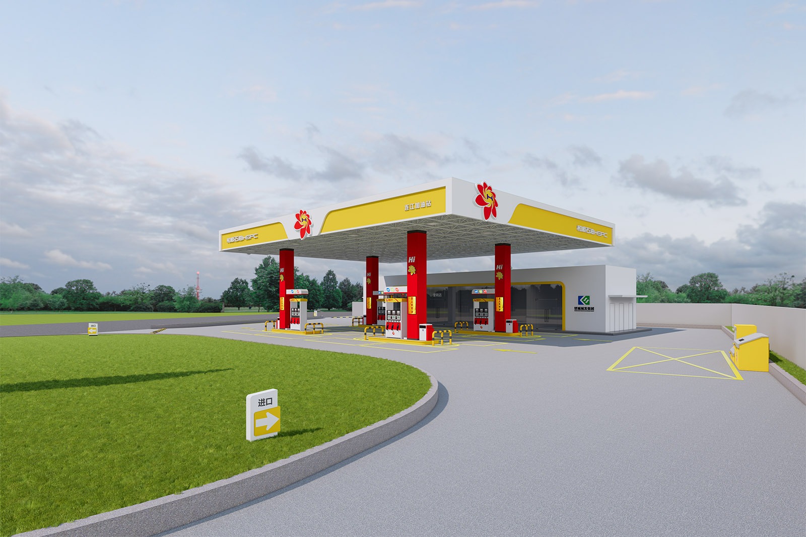
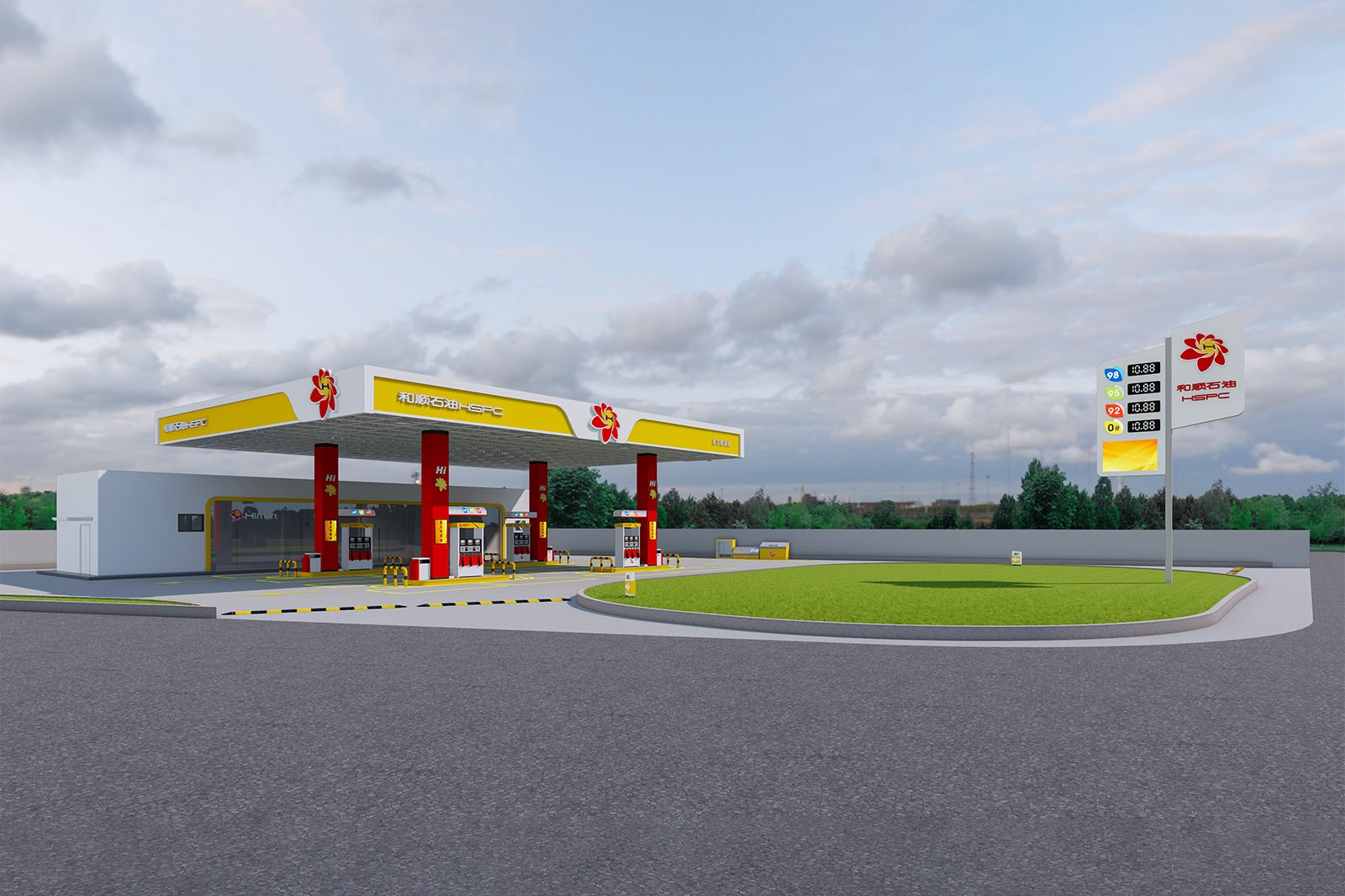
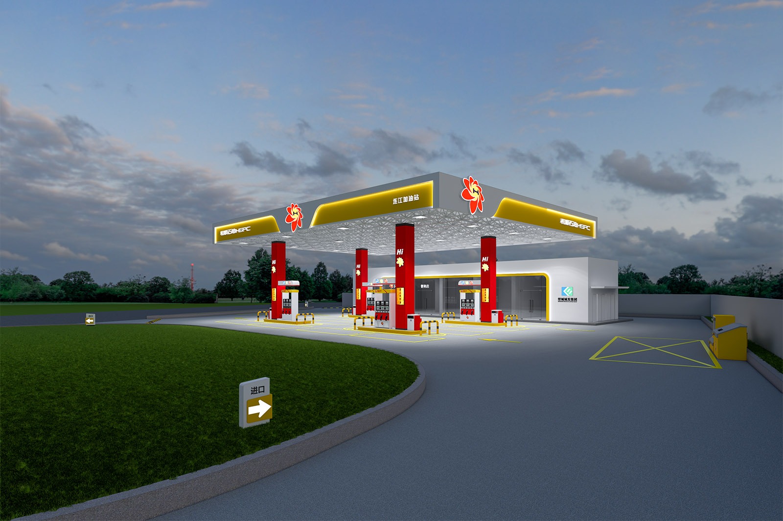
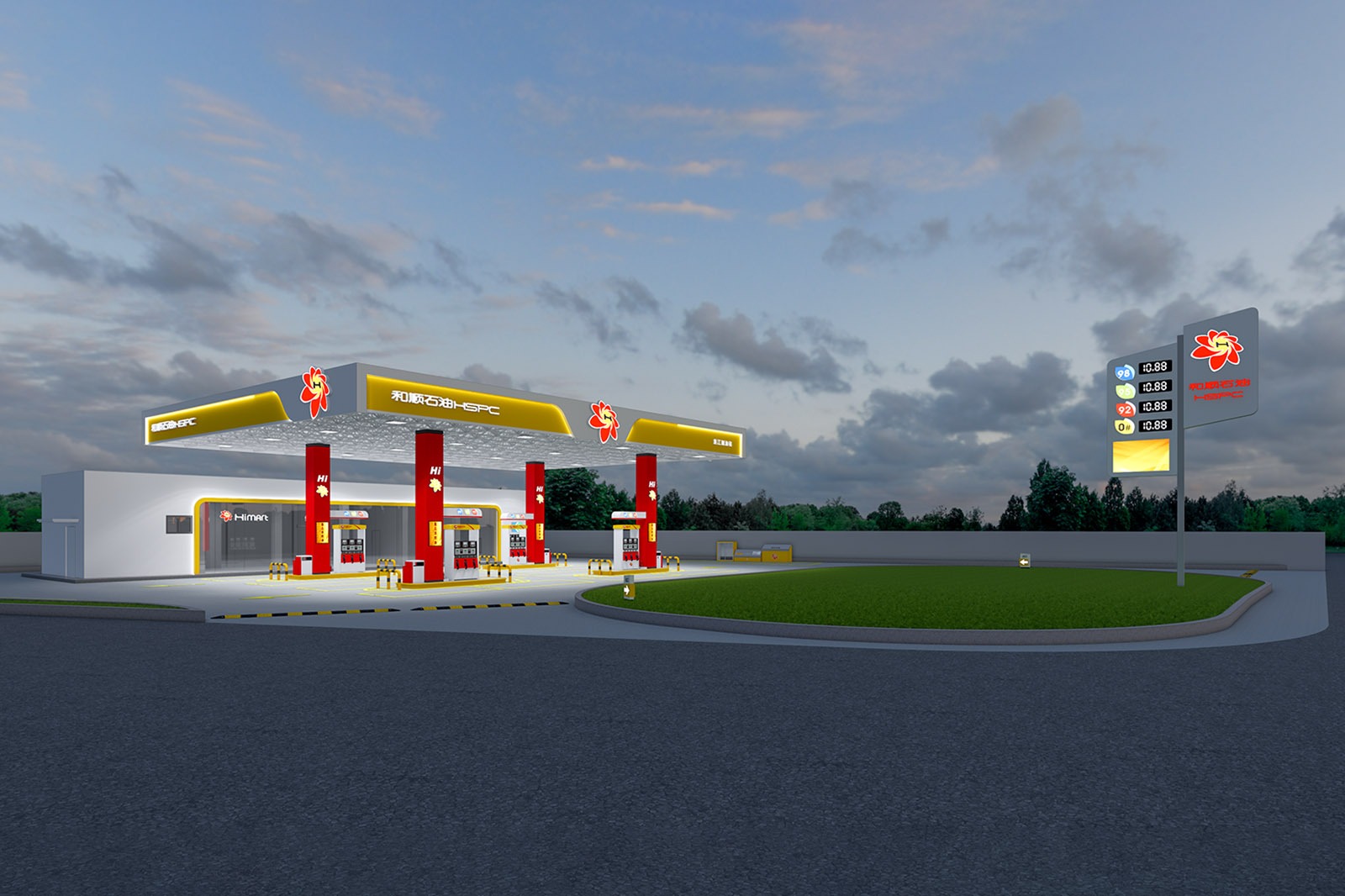
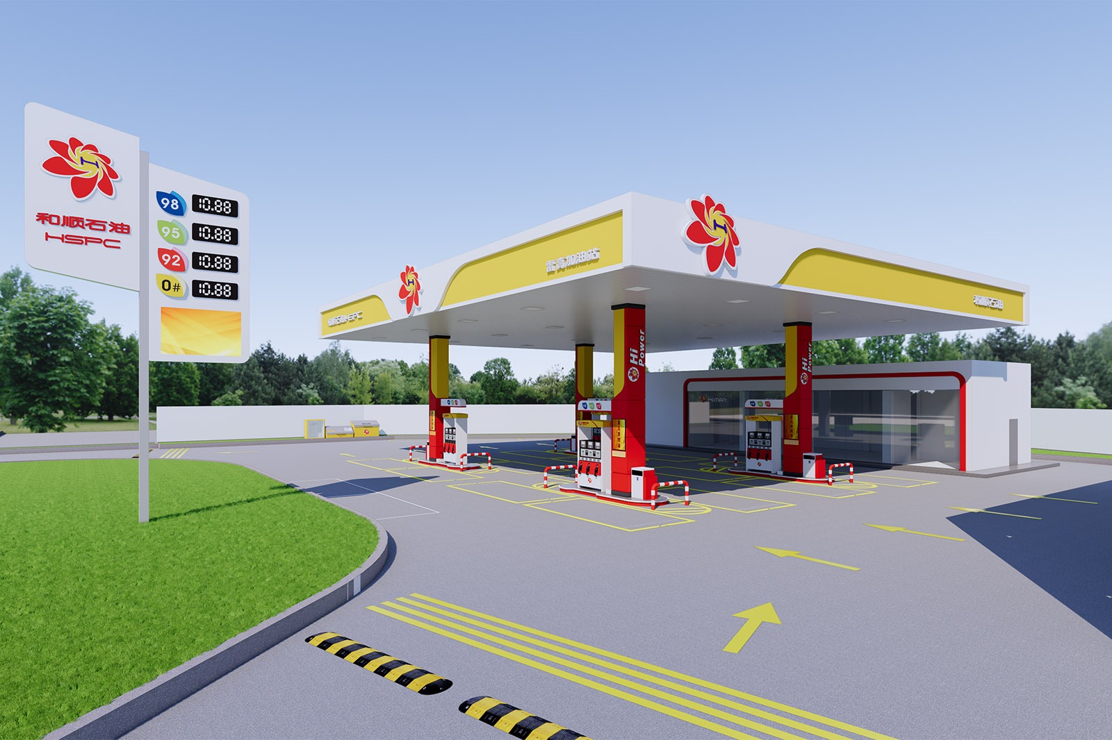
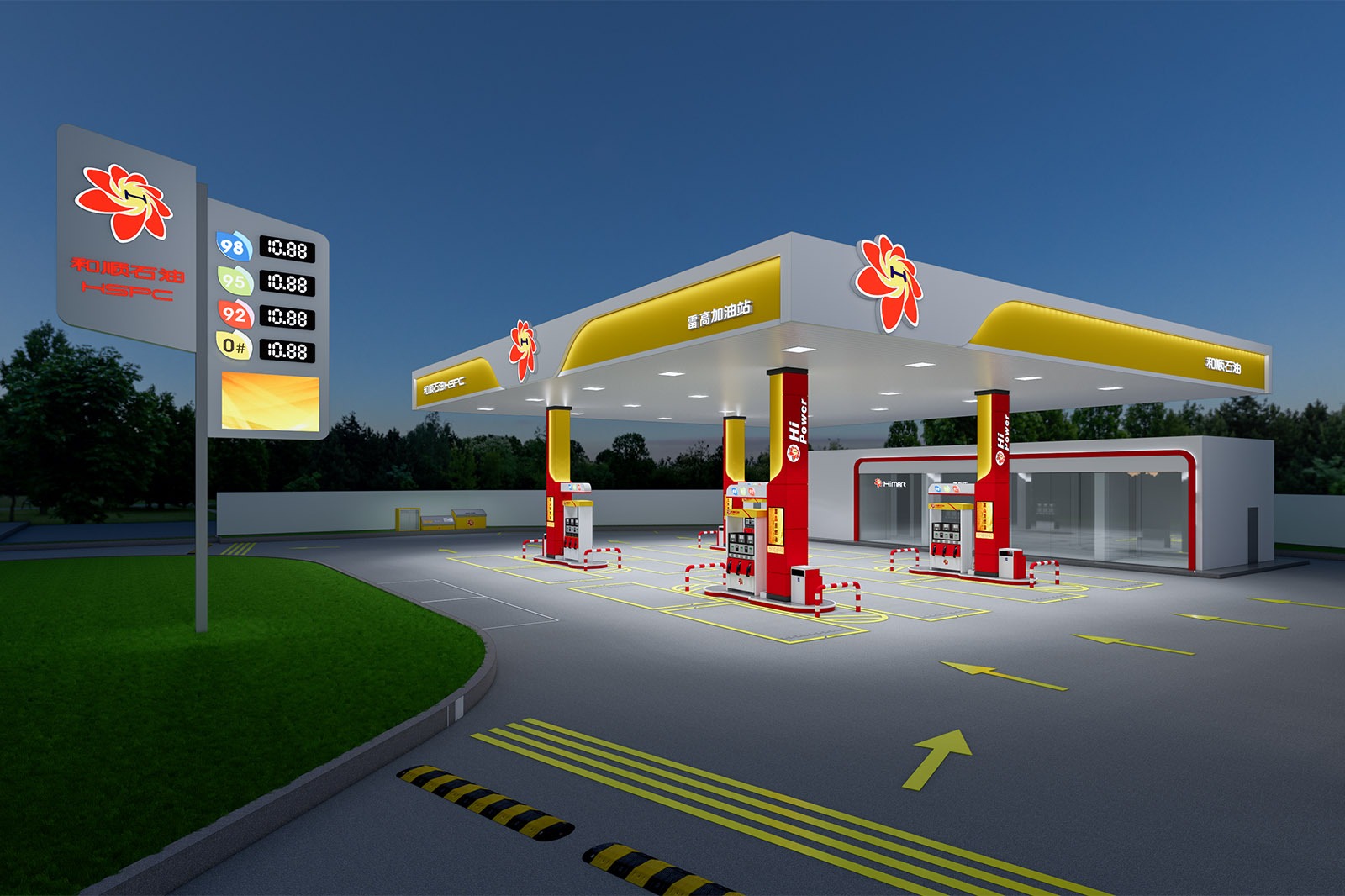
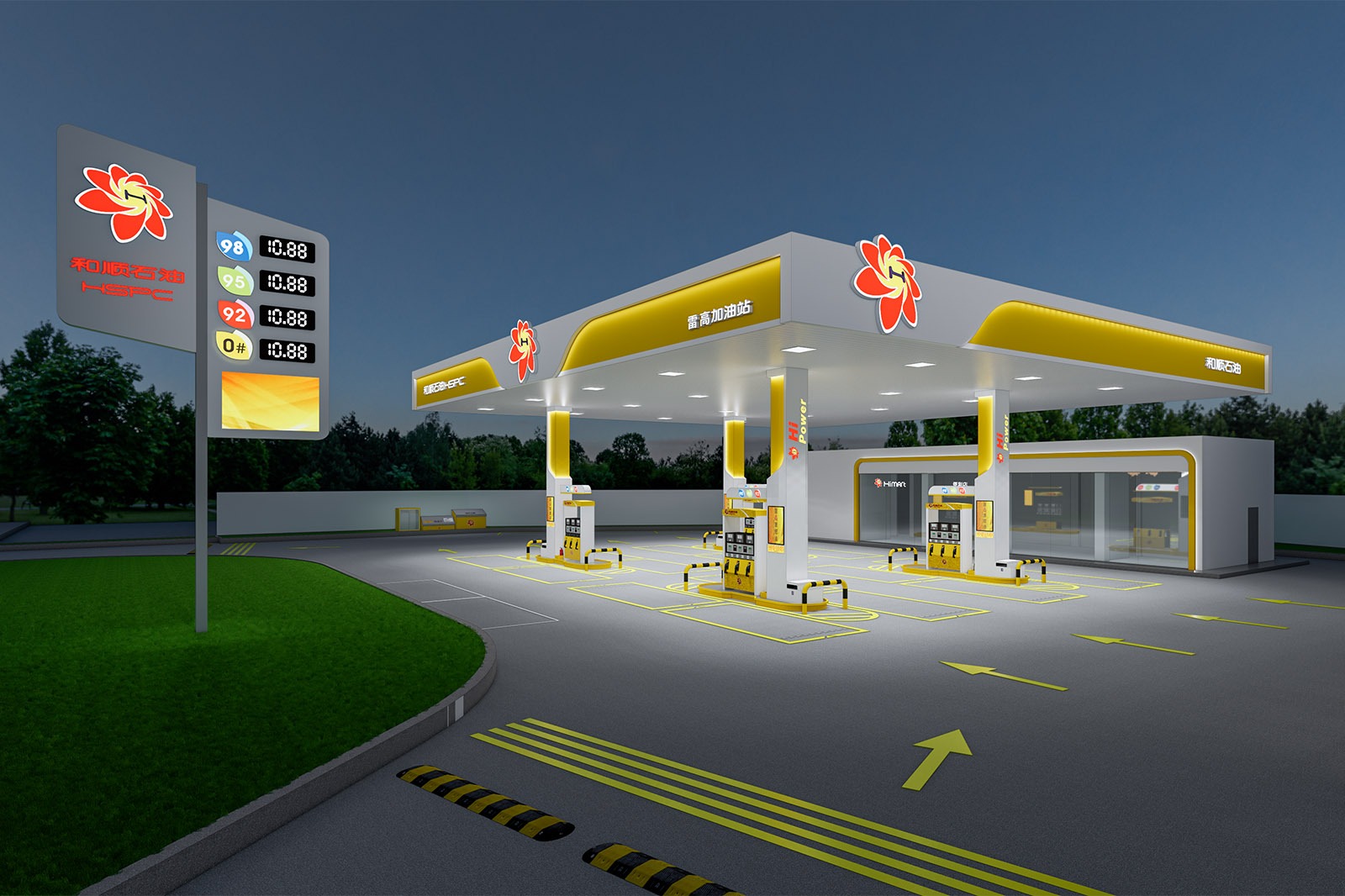
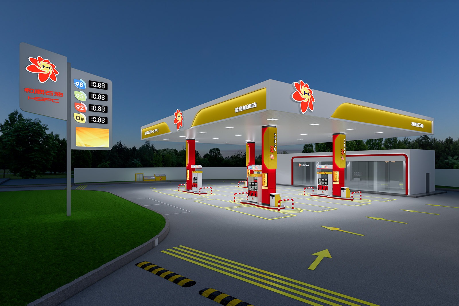
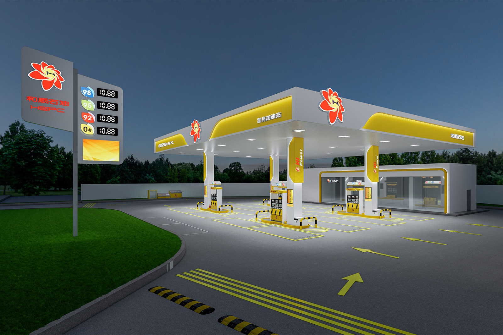
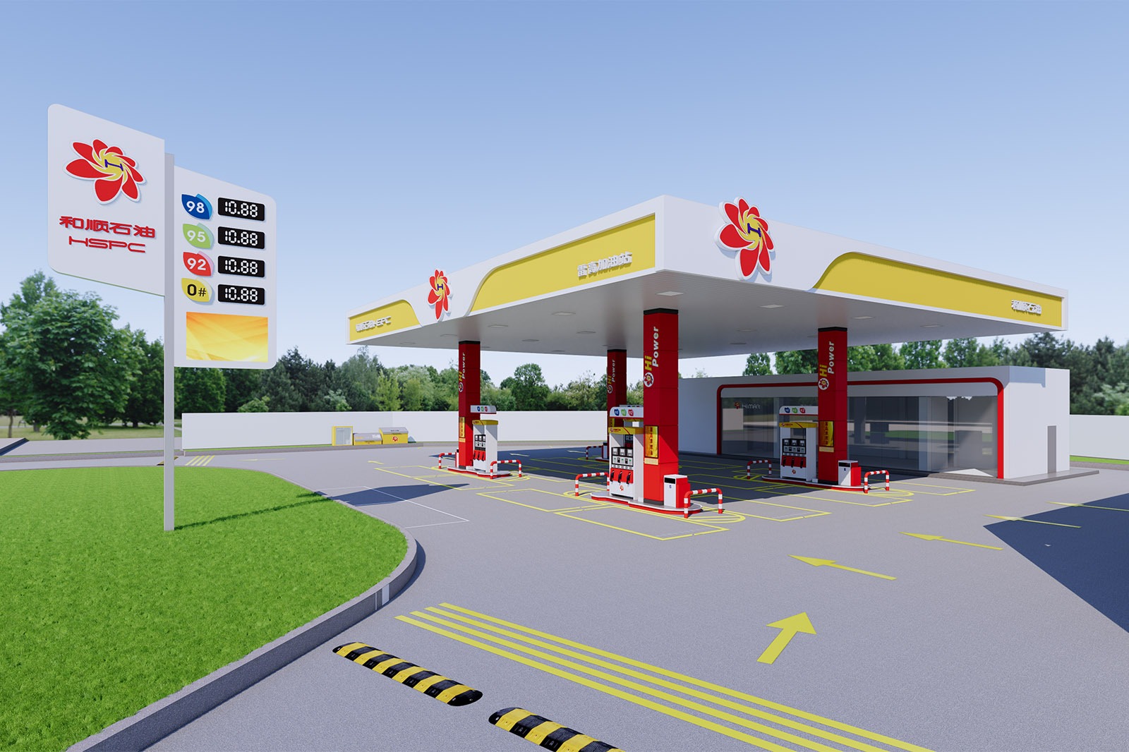
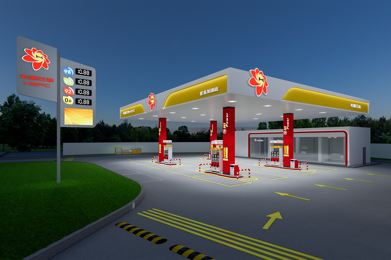
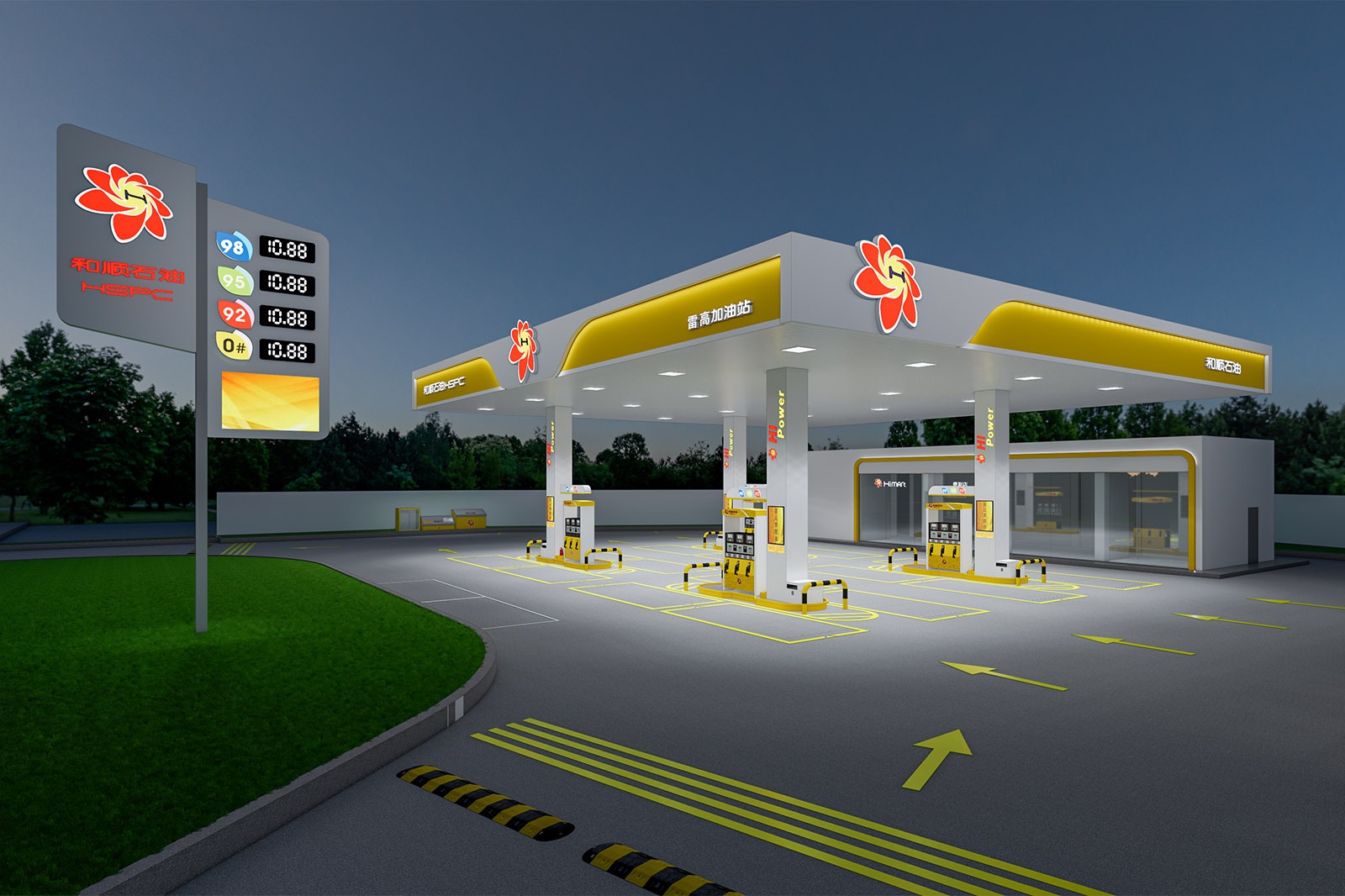
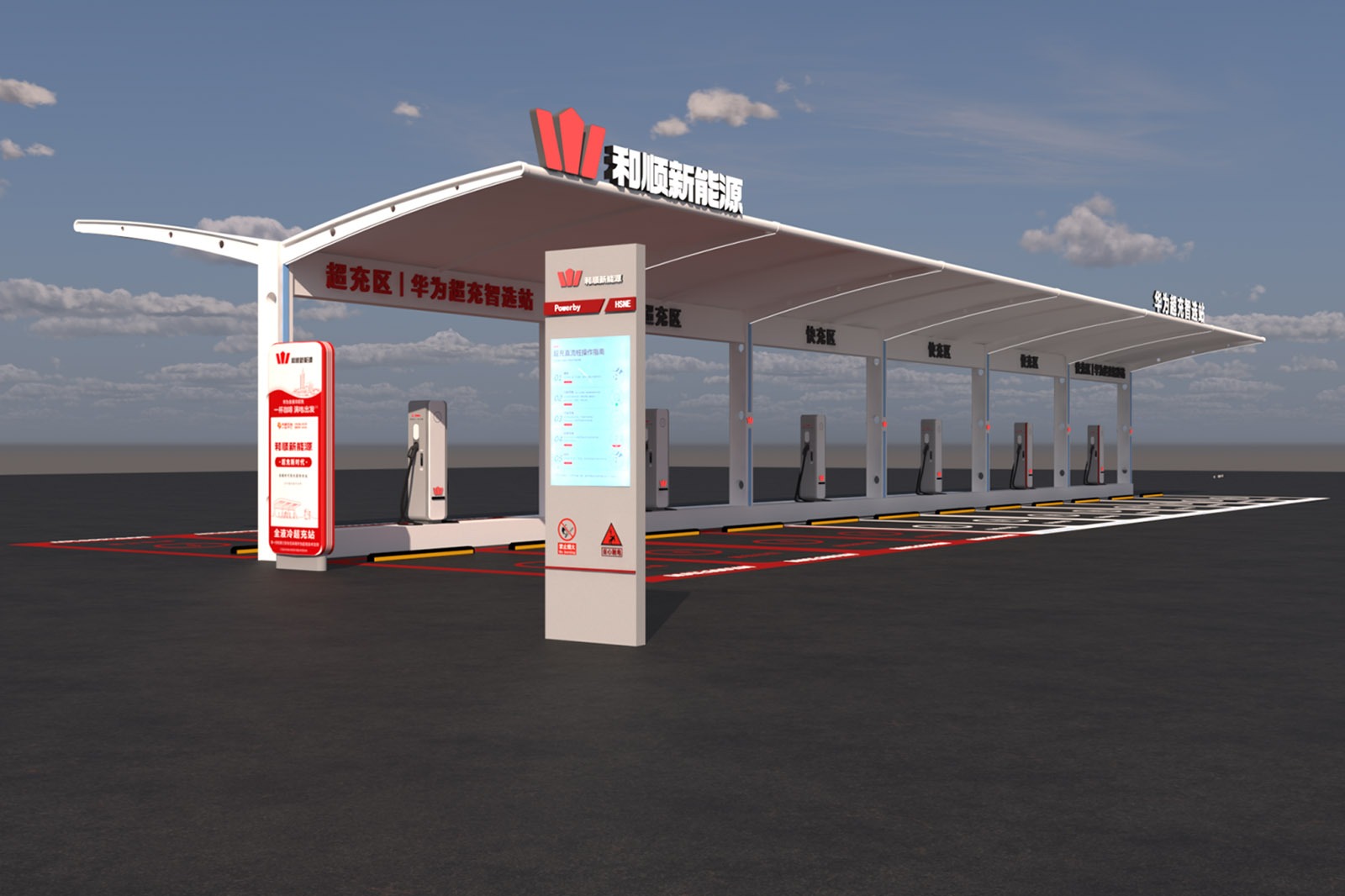
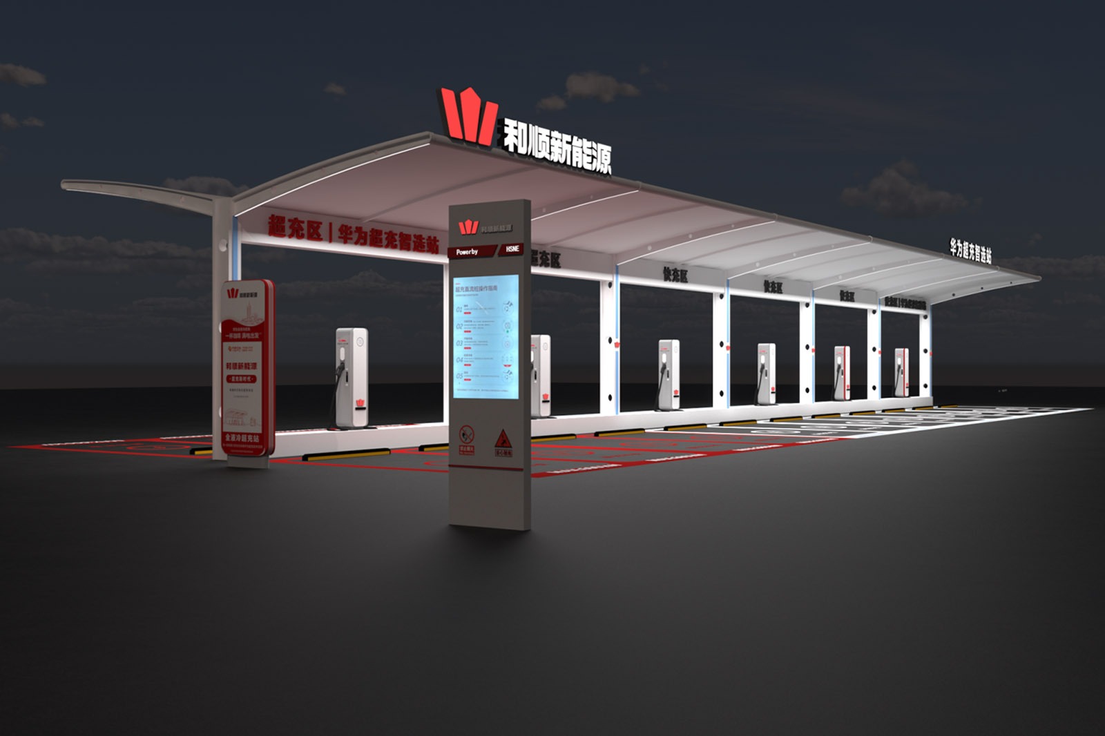
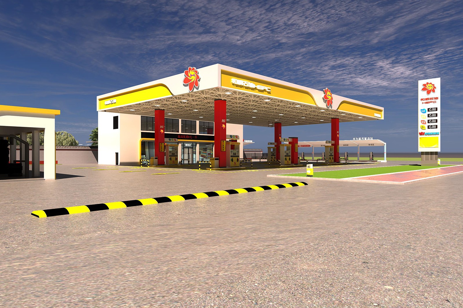
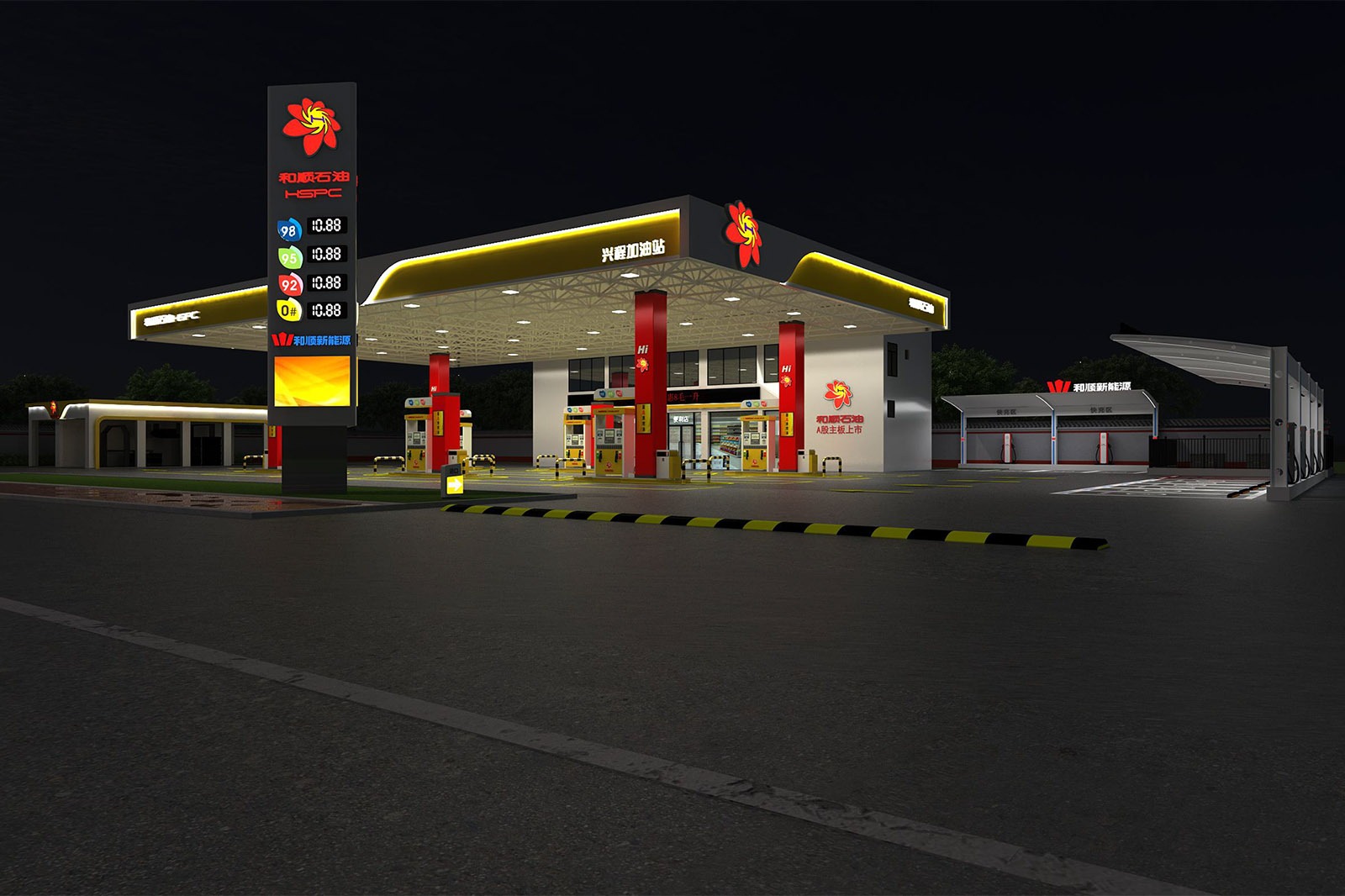
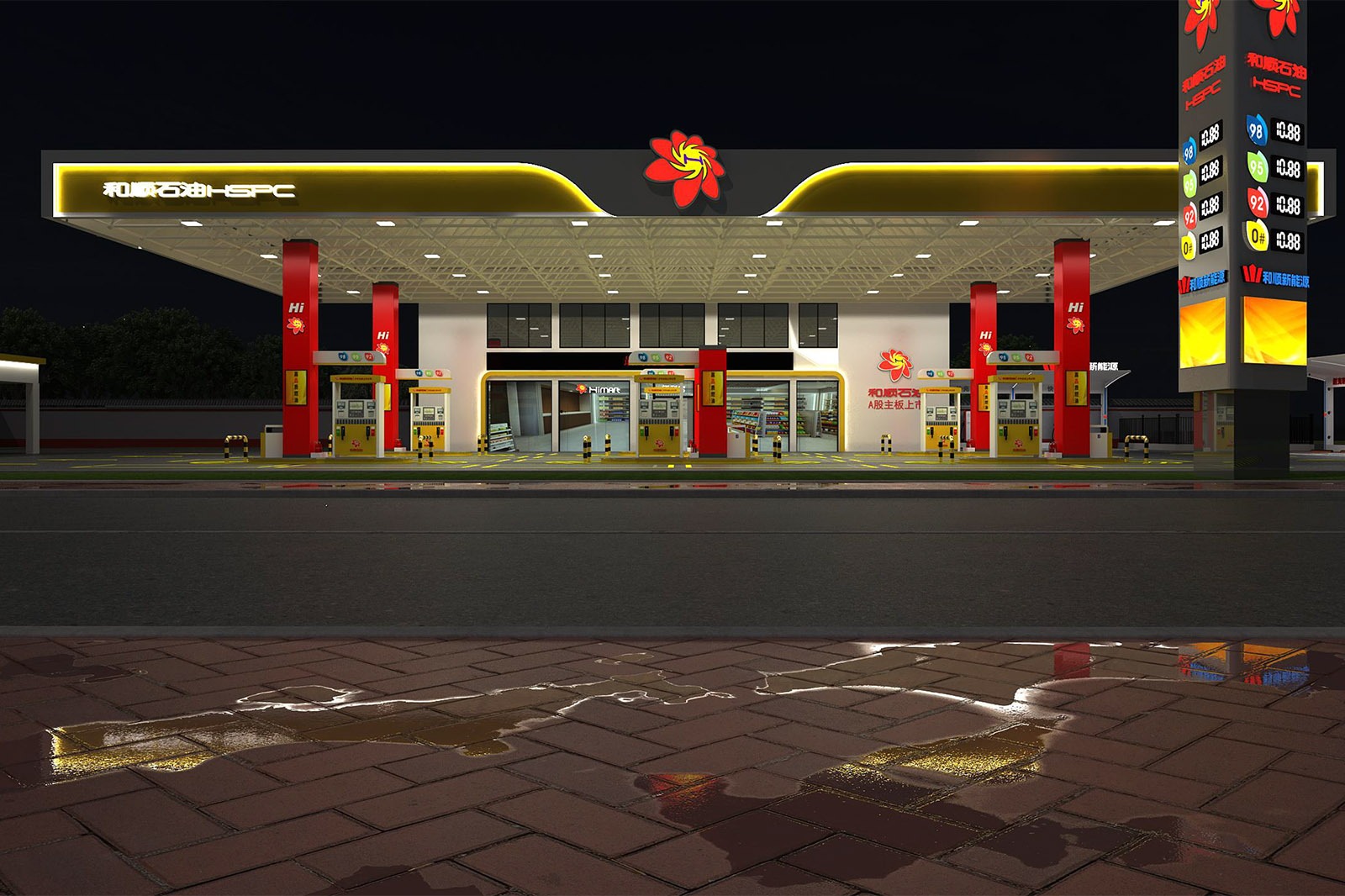
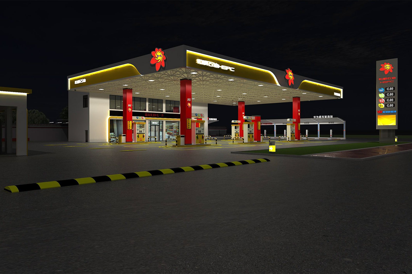
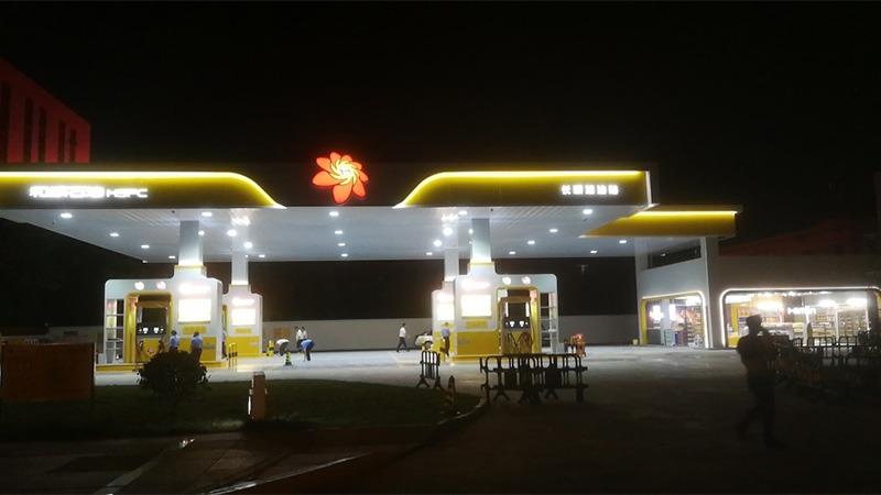
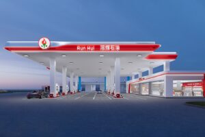
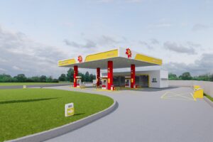
Heshun Petroleum’s Design Concept: Empowered by Hunan Charm, a New Chapter for Gas Stations
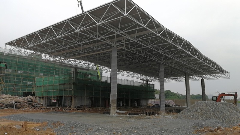
Project Location: Mulian West Road, Tianxin District, China
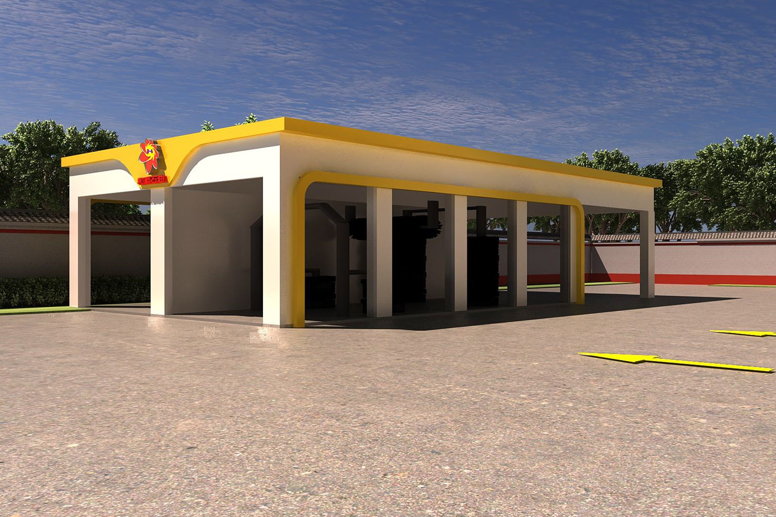
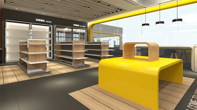
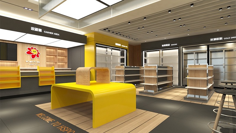
Design color tone: Off-white + Light yellow + Chinese red
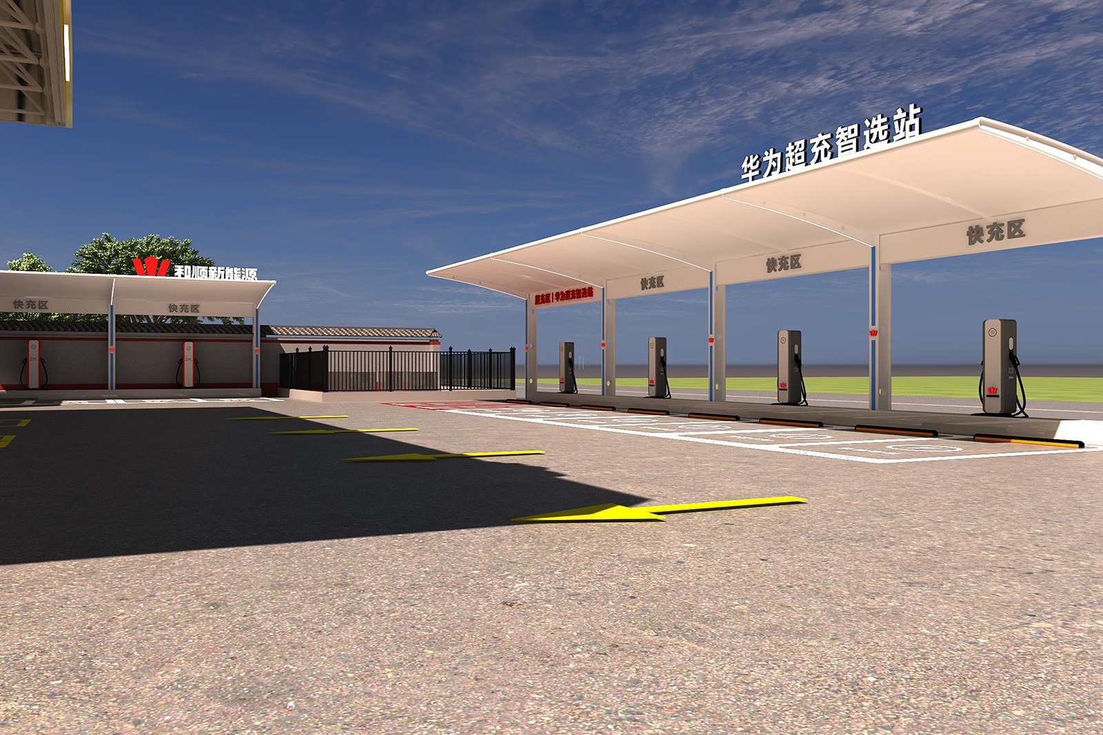
Project area: 500 ㎡
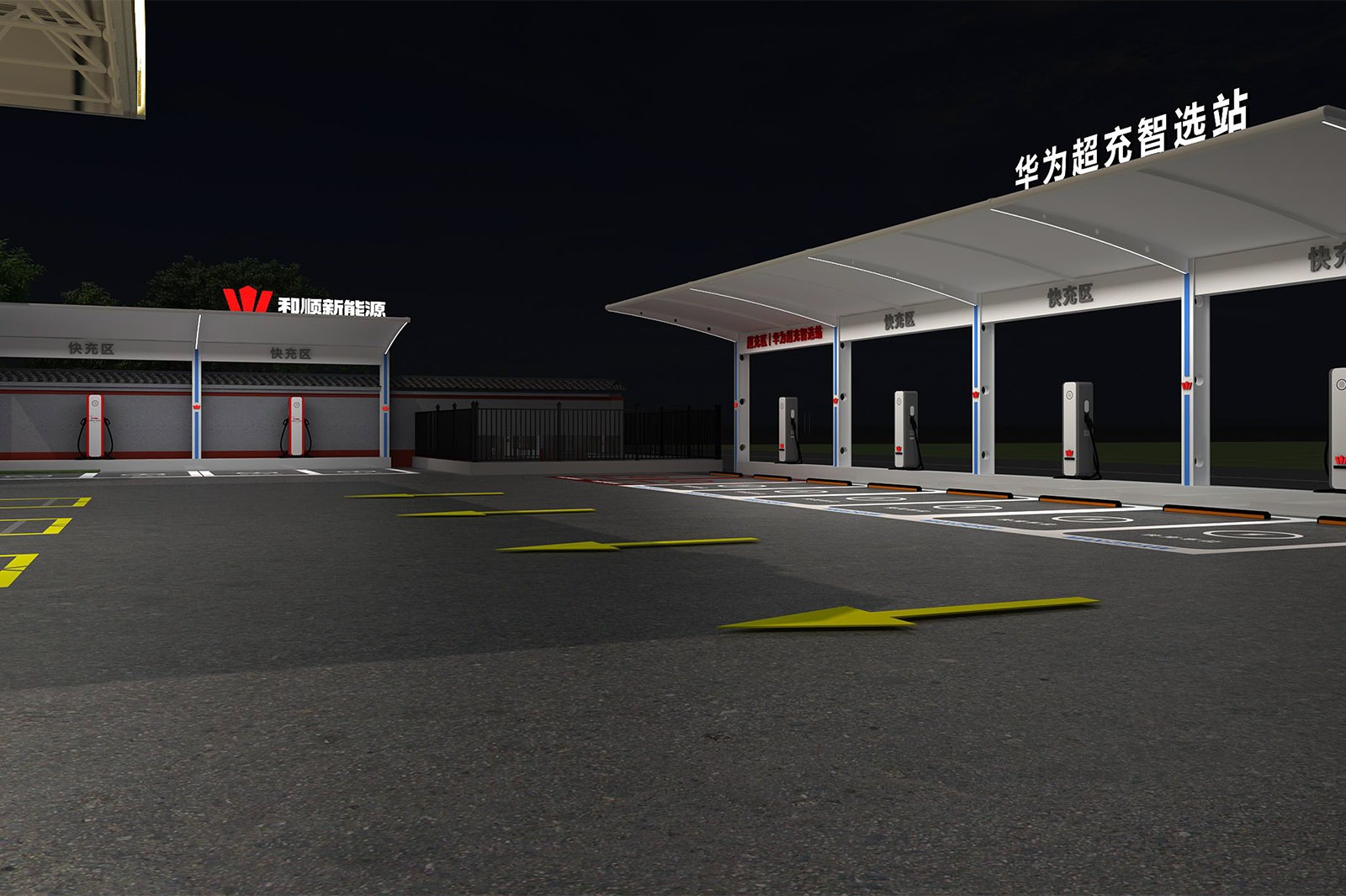
Project Content: Eaves + column wrapping + aluminum buckle ceiling
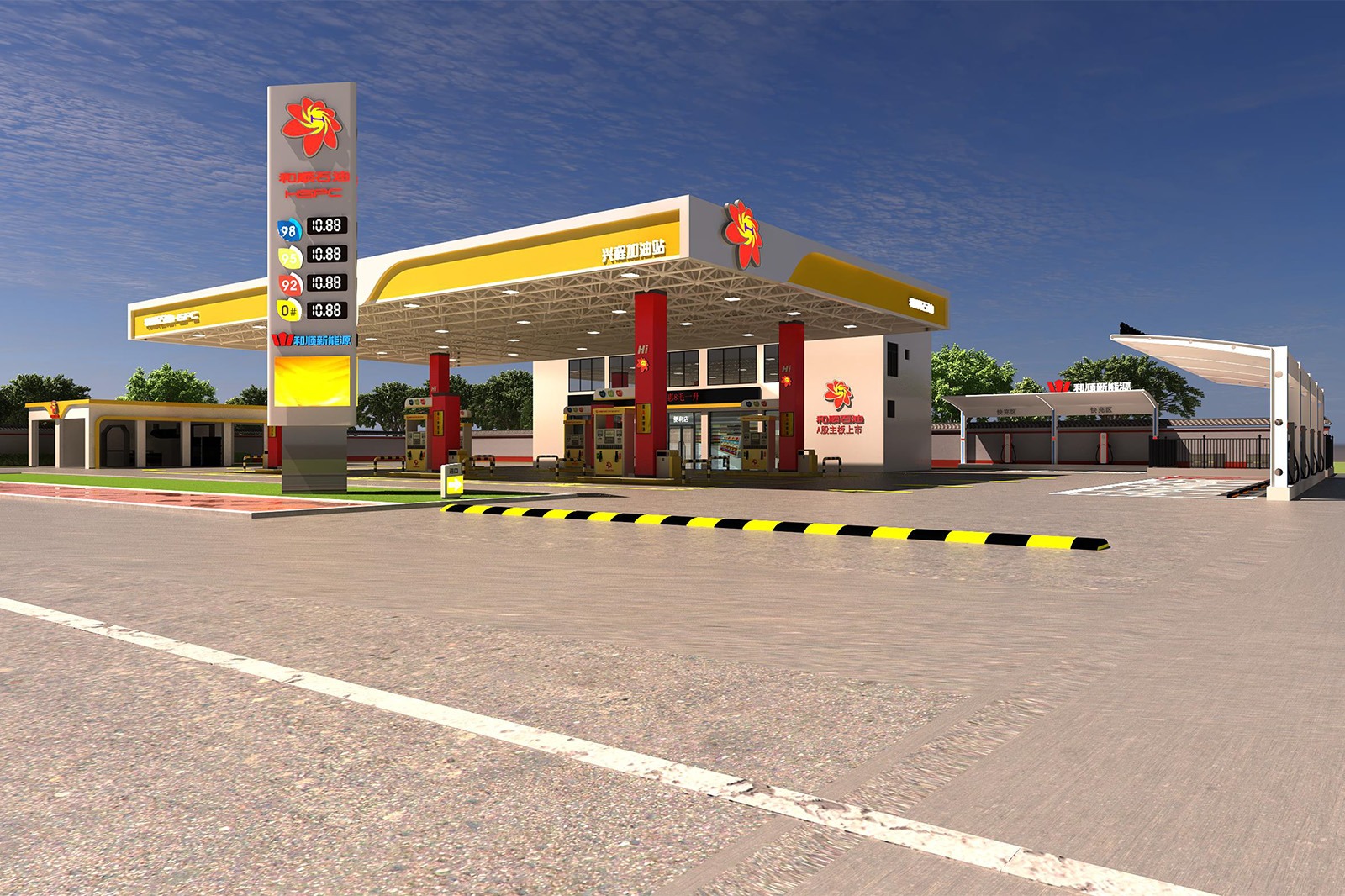
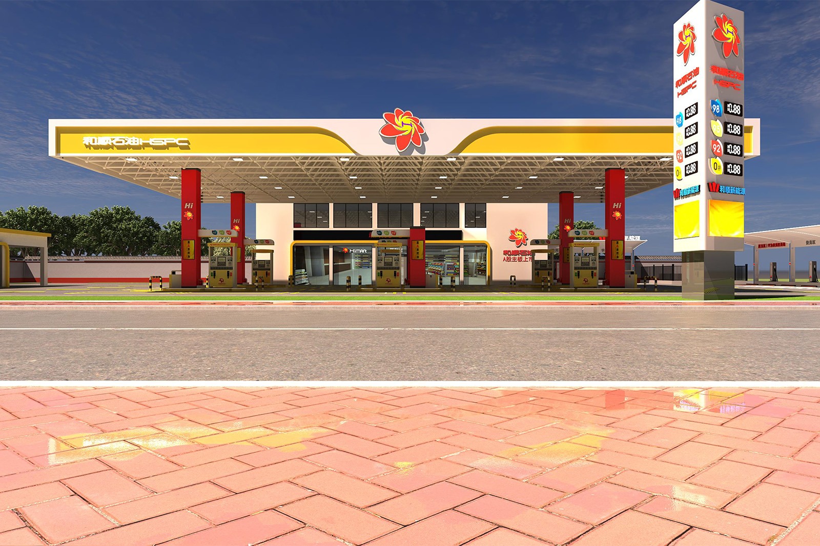
Brand Symbol: Blooming Hibiscus, Hunan Spirit as the Soul
The hibiscus flower, a symbol of Hunan’s regional culture, serves as the core visual element and is integrated into the gas station’s signage. Hibiscus blossoms on the canopy and columns, echoing the Heshun brand’s roots in Hunan and conveying a warm and approachable brand personality. The primary color combination of yellow and red continues the energy industry’s vitality while alluding to the passionate and enterprising spirit of Hunan culture. This makes the gas station a platform for the fusion of Hunan culture and modern energy services, allowing drivers to experience the warmth of the Hunan brand the moment they enter.
Leave Your Message
Hibiscus Skyline, Extending Hunan Charm
Canopy Design
The canopy’s outline is defined by simple, flowing lines, with a primary yellow and white color scheme, resembling the bright backdrop of a clear Hunan sky. Hibiscus flower logos dotted on either side break the monotony and incorporate regional symbols of Hunan. Visually, the canopy resembles outstretched wings, symbolizing a safe and secure journey for drivers. It also resembles enlarged hibiscus petals, extending the “Hibiscus Reflects Hunan” design concept from the logo to the entire space, conveying the brand’s vision of being rooted in Hunan and serving the travel industry.
Hibiscus Columns, Spiritual Heritage
Column Design
The hibiscus flowers on the red columns, combined with the brand’s elements, become a visual focal point. Red symbolizes the warmth and vitality of Hunan culture. The columns, like cultural totems within the city, embody the spirit of the region. Their upright form not only ensures the structural stability of the canopy, but also, like a “hibiscus in bloom,” conveys Heshun Petroleum’s reliable and solid brand image to drivers, transforming industrial facilities into a vehicle for cultural heritage. Each column embodies the fusion of “Hunan Spirit” and “Energy Services.”
Simple Integration, Functional Humanity
Station Building Design
The exterior of the station building features simple geometric forms, with white as the primary color, echoing the canopy and columns. The extensive, transparent design seamlessly connects indoor and outdoor spaces, meeting the functional needs of fueling services and a convenience store while creating an open and welcoming atmosphere. The station building resembles a modern interpretation of Hunanese traditional dwellings, its simplicity concealing a humanistic approach. This elevates the gas station from a simple fuel refueling point to a welcoming stop for drivers on their journeys.
Signage System
Station Building Exterior
From the canopy to the pillars and on-site signage, the hibiscus flower logo appears repeatedly, reinforcing brand recognition. The fuel price signs, import and export signs, and other features feature a simple, clear design, meeting the station’s requirements for efficient service. Incorporating the brand’s colors and hibiscus elements, these functional signs also serve as a showcase for the brand’s culture. Every sign conveys the design concept of “Hibiscus Reflects Hunan,” deepening drivers’ understanding of Heshun Petroleum’s “Xiangqing Service” brand image.
The overall design integrates the hibiscus flower, a symbol of Hunan, with the energy service space through exterior elements such as the canopy, columns, station building, and signs, making regional culture the design soul of the gas station and constructing a modern energy supply scene that is rich in Hunan charm and warms people’s hearts.
Related products
Related products
-
Gas Station
Hongcheng Petroleum Gas Station
-
Gas Station
Lemon Petrochemical Gas Station
-
Gas Station
Haru Petroleum Gas Station


