What We Do
Our Work
Join Us
Our Products
Home
Contact
About Us
imgi_8_changheng-energy-gas-station-5 imgi_4_changheng-energy-gas-station-2 imgi_5_changheng-energy-gas-station-3 imgi_6_changheng-energy-gas-station-4 imgi_7_changheng-energy-gas-station-6 imgi_8_changheng-energy-gas-station-5 imgi_3_changheng-energy-gas-station-1

Changheng Energy Gas Station

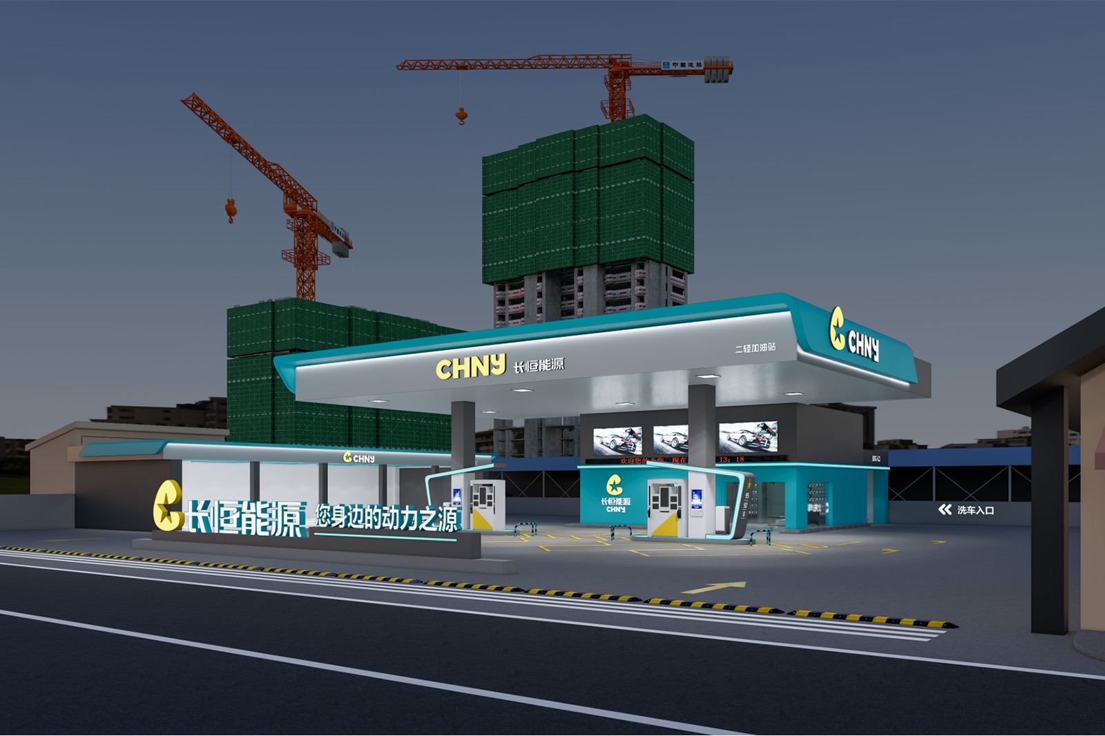
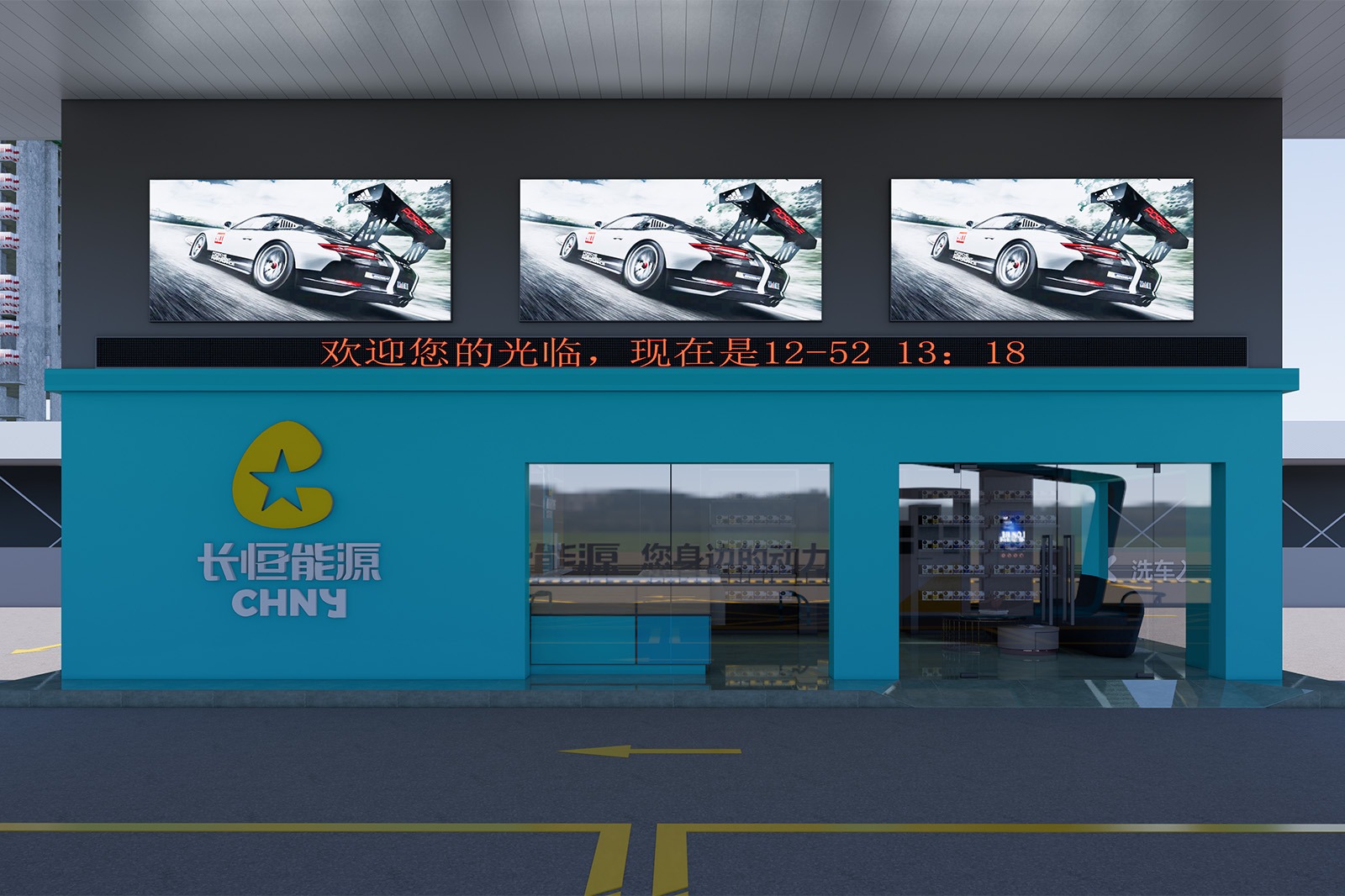
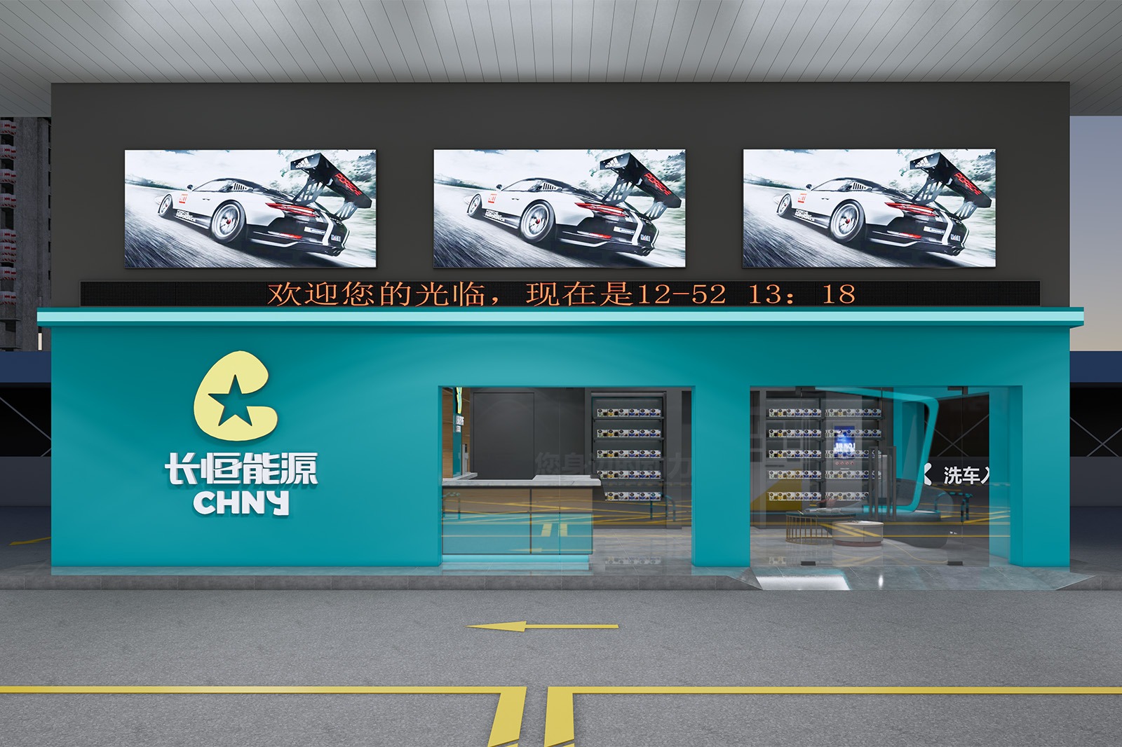
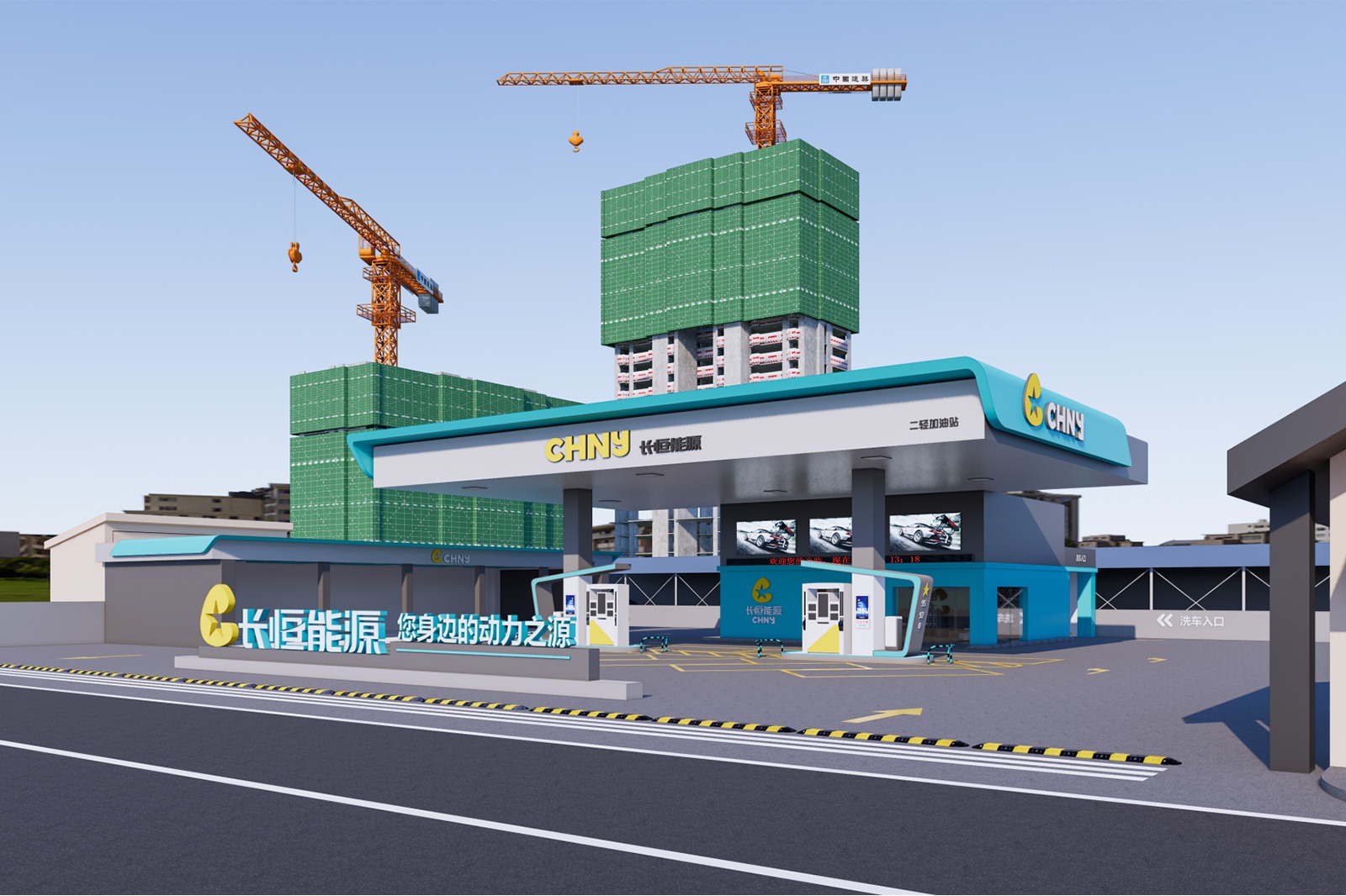
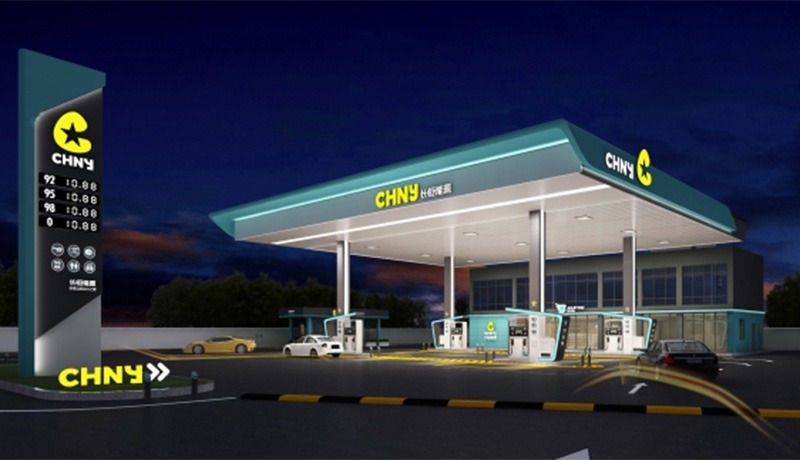
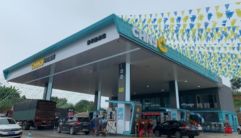
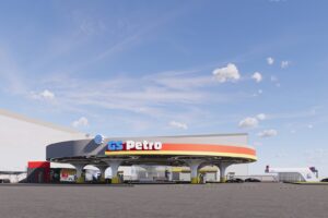
Design Concept: Starlight in Hunan, Embarking on a New Journey
Project Location: Maojiaqiao No. 2 Light Industry Gas Station, Kaifu District, Changsha City, Hunan Province, China.
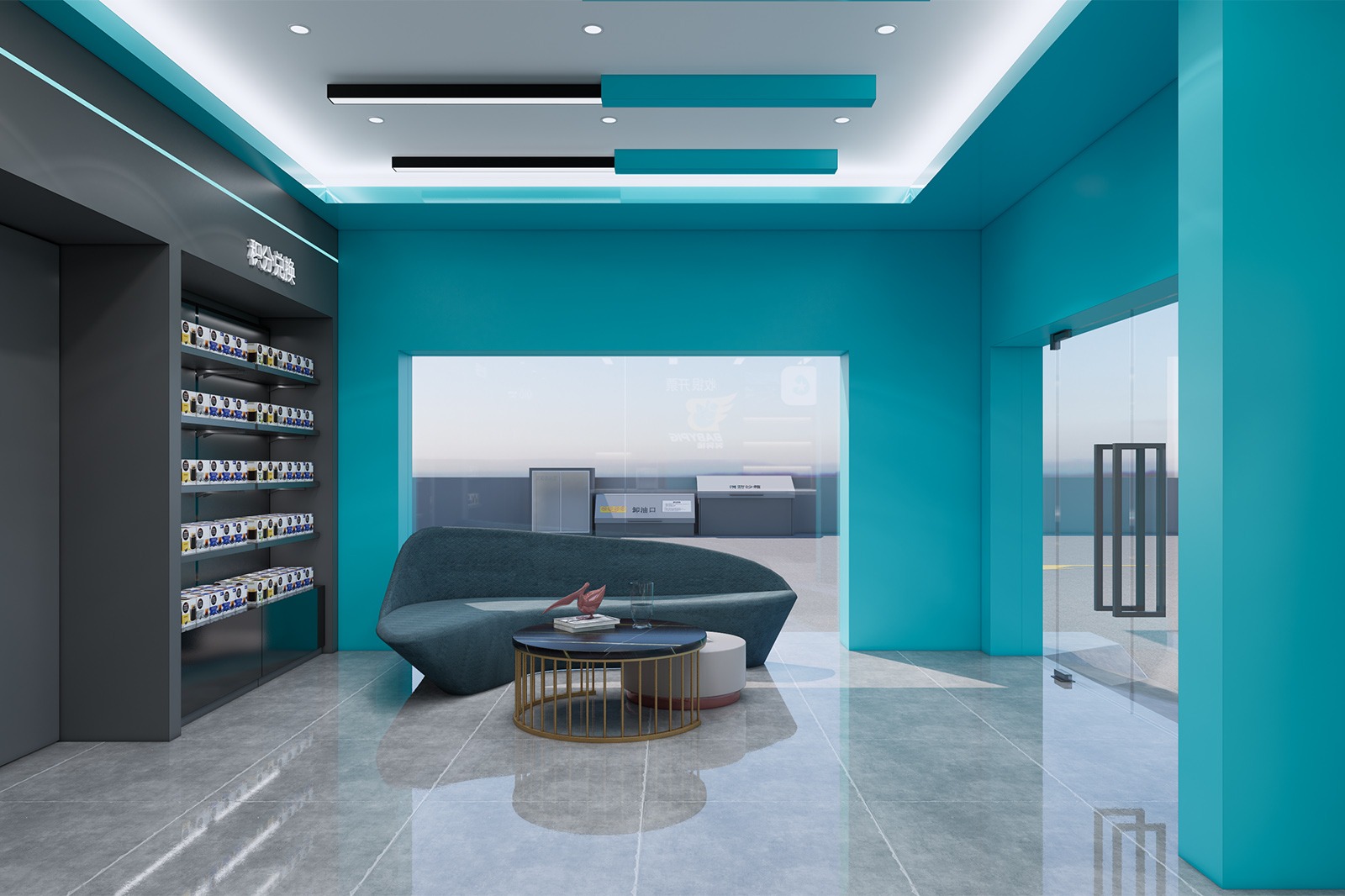
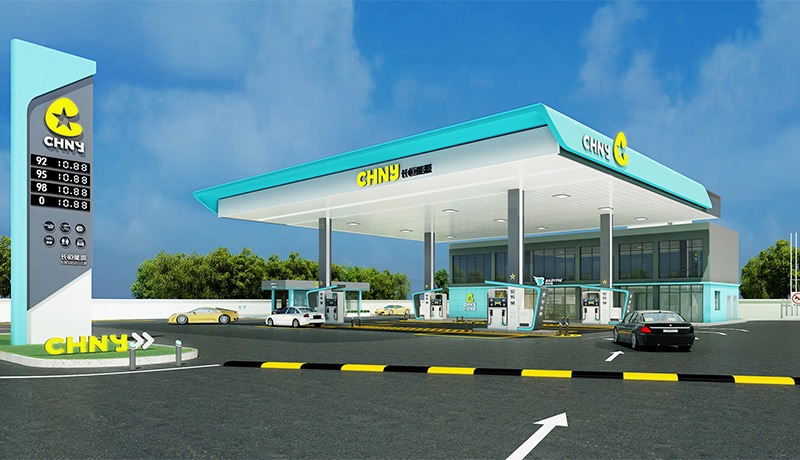
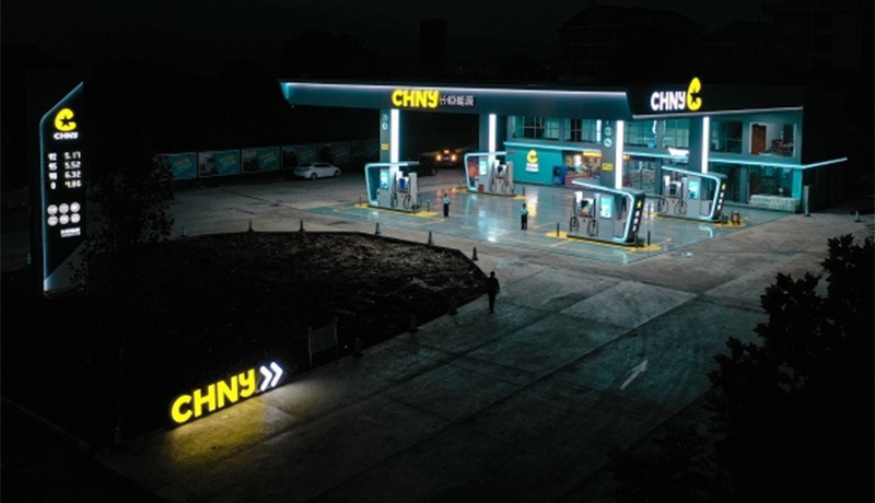
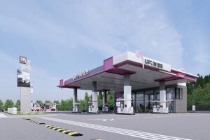
Design color tone: High-gloss light blue + pure white
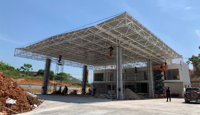
Project area: 600 ㎡
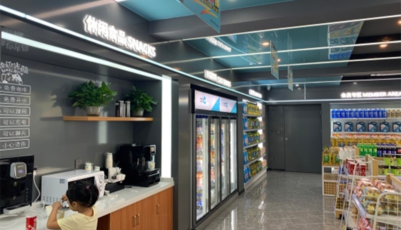
Project Content: Eaves + column wrapping + aluminum buckle ceiling + landscape characters

The starlight serves as the core visual symbol, echoing the “heng” (constant) and enterprising spirit of the “Changheng (CHNY)” brand name.

Brand Pillar

ARCHITECTURAL FORM

The brand pillar creates a visual focal point with vibrant color layering and geometric forms. The blue-gray primary color scheme echoes the technological and reliable brand DNA of “Changheng (CHNY).” The yellow star logo and brand name, like stars in the night sky, illuminate the refueling information. Clearly displayed fuel prices and service signs act as an “energy guide,” meeting drivers’ need for quick information while serving as a prominent roadside beacon, conveying the brand’s philosophy of “precise service and efficient refueling.”

Canopy

A Flowing Sky, a Constant Rhythm

The canopy features a smooth, zigzag design. The blue-gray gradient evokes the alternating dawn and dusk of the Hunan sky, outlining a dynamic skyline. This design breaks the monotony of traditional gas stations and evokes the dynamic rhythm of Hunan’s landscape. Its form evokes the concept of “constant motion,” resembling the trajectory of energy flow, conveying Changheng Energy’s vision of continuously empowering vehicles and fueling journeys. Drivers, the moment they arrive at the station, sense the brand’s commitment to “constant motion.”

Fueling Stations

Technological Units, Star Matrix

The fueling stations, with their simple geometric shapes and unified color scheme, incorporate the brand’s star logo, creating a technologically-charged “energy matrix.” A blue-gray primary color scheme with yellow details reinforces brand identity. The compact and organized layout of the stations, adapted for intelligent refueling equipment, conveys the concept of “technology-enabled energy replenishment.” Each station, like an independent “energy unit,” symbolizes Changheng Energy’s commitment to providing standardized, intelligent services to drivers, ensuring efficient vehicle endurance.

Station Exterior

Smart Window, Integrating Hunan Style

The station’s exterior features a combination of transparent glass and simple walls. The blue-gray color scheme continues the overall design. Electronic screens, like “smart windows,” showcase energy information and the service ecosystem. The geometric wall divisions echo the design language of the brand pillars, incorporating the minimalist DNA of Hunan’s regional architecture. This space serves as both an extension of energy services and a “smart interface” for interaction between the brand and vehicle owners. It conveys Changheng Energy’s brand values ​​of “openness, intelligence, and integration,” transforming the gas station into a “technological energy station” for travel in Hunan.

The overall design, centered around the “starburst” symbol, connects various exterior elements, blending a sense of technology with the rhythm of Hunan culture. This embodies Changheng Energy’s design philosophy of “precise service, dynamic empowerment, and intelligent integration,” creating a highly recognizable and user-friendly energy refueling landmark on Hunan roads.

Completed Project Photos

Contact Us
Scroll to Top