What We Do
Our Work
Join Us
Our Products
Home
Contact
About Us
imgi_3_runhui-petroleum-gas-station-9 imgi_5_runhui-petroleum-gas-station-7 imgi_6_runhui-petroleum-gas-station-6 imgi_7_runhui-petroleum-gas-station-5 imgi_8_runhui-petroleum-gas-station-4 imgi_9_runhui-petroleum-gas-station-3 imgi_10_runhui-petroleum-gas-station-2 imgi_11_runhui-petroleum-gas-station-1 imgi_3_runhui-petroleum-gas-station-9 imgi_4_runhui-petroleum-gas-station-8

Runhui Petroleum Gas Station

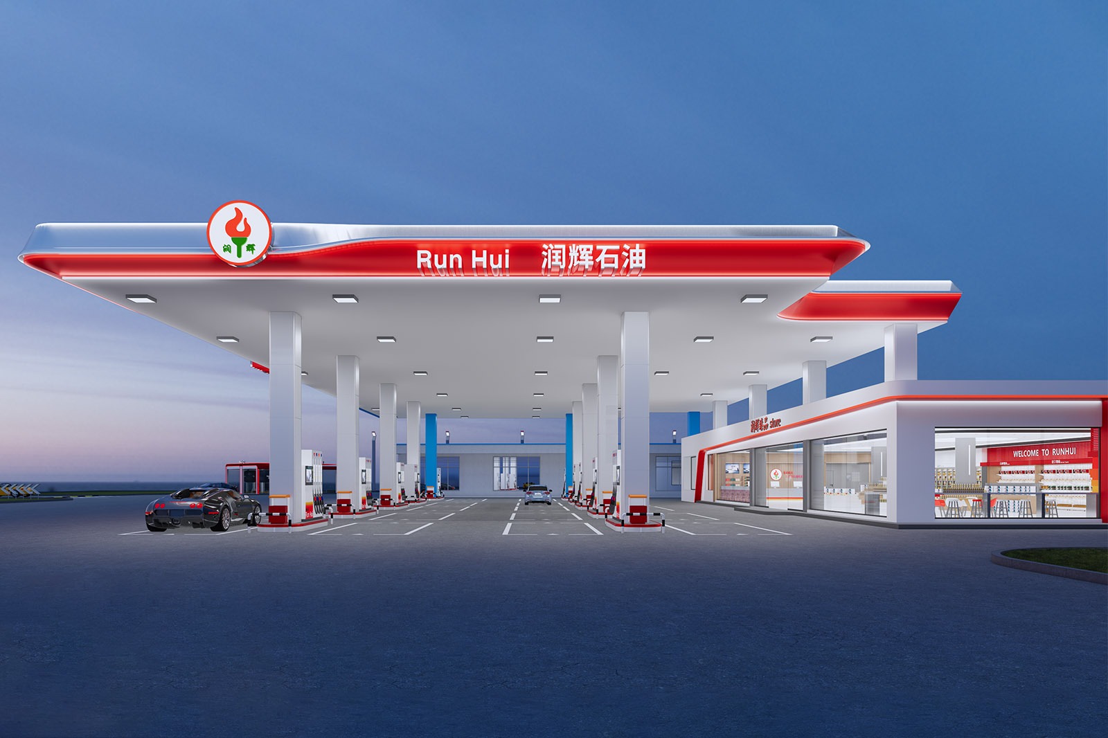
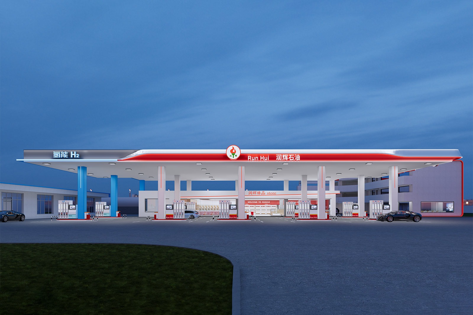
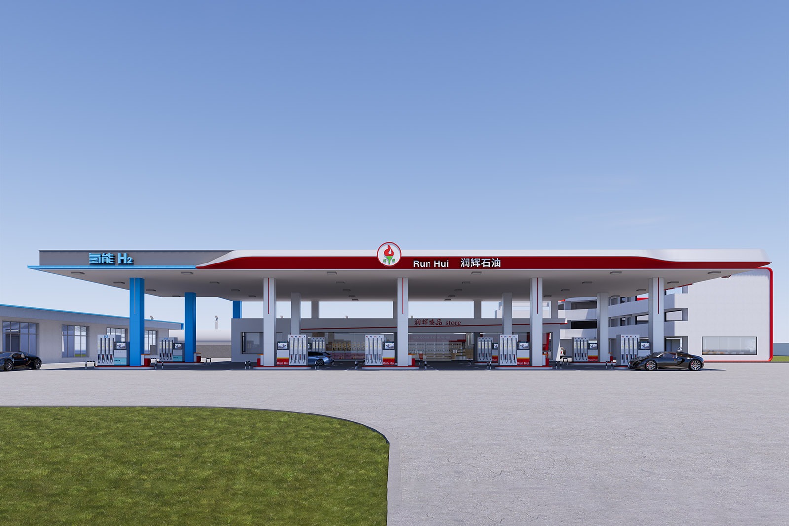
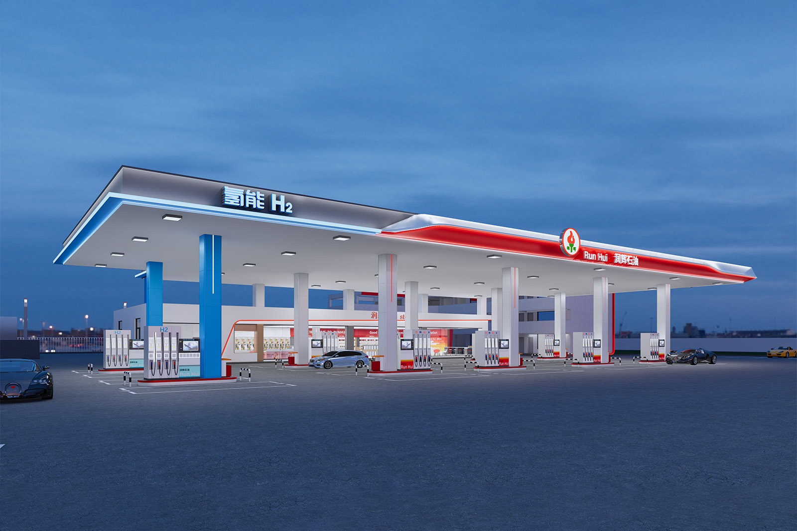
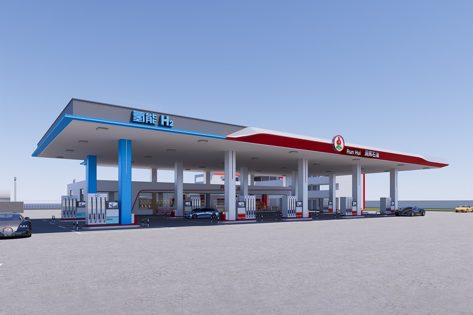
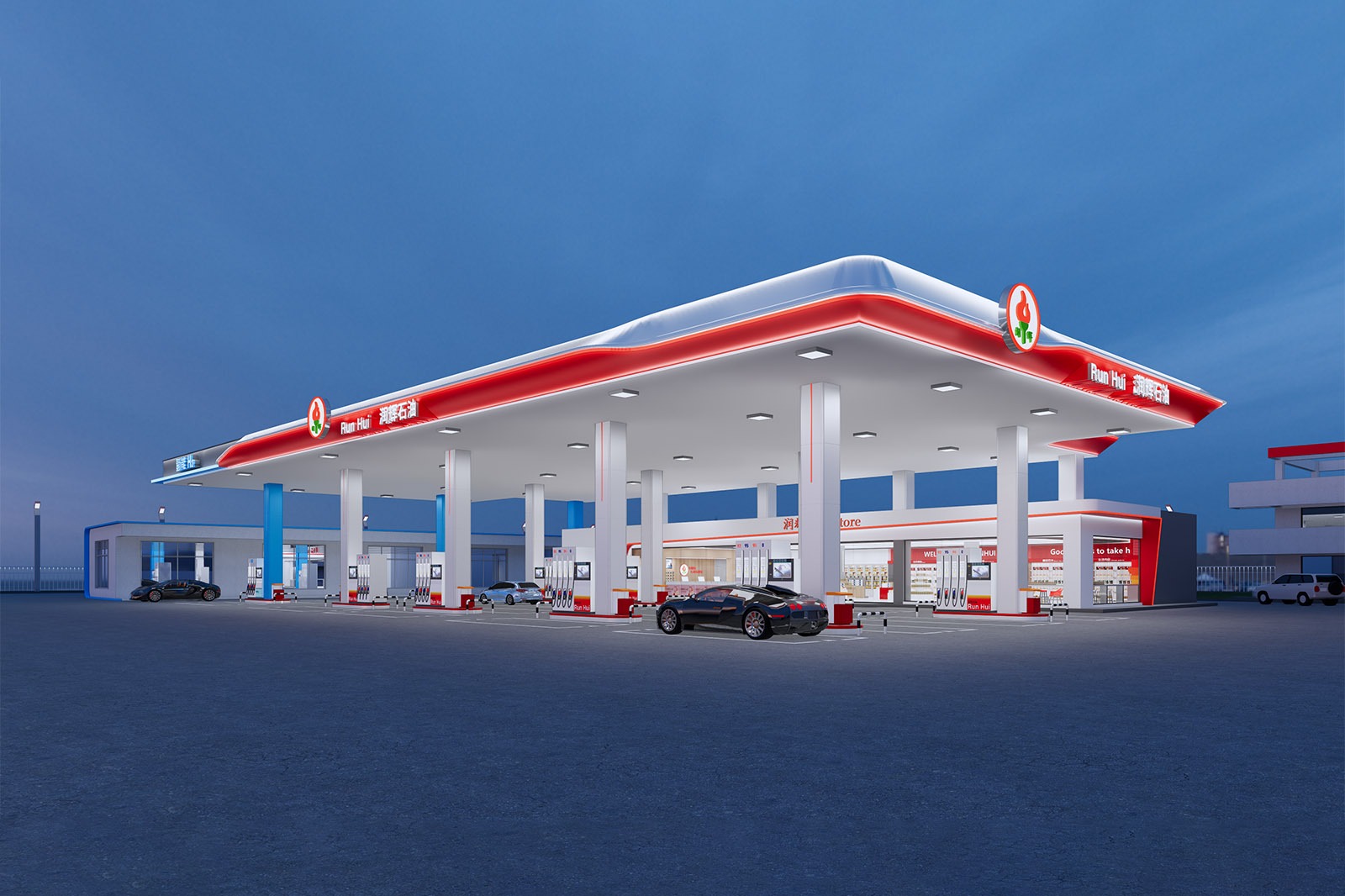
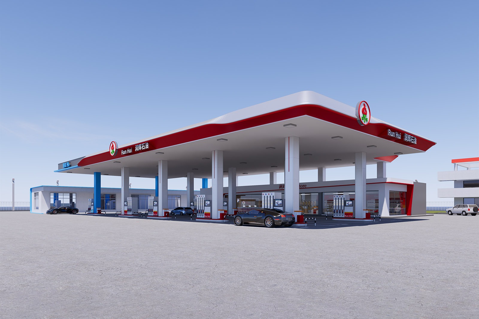
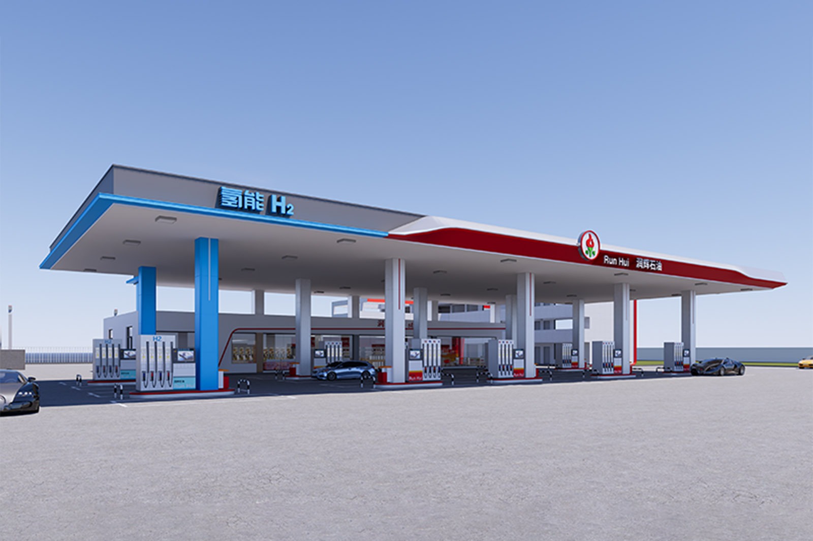
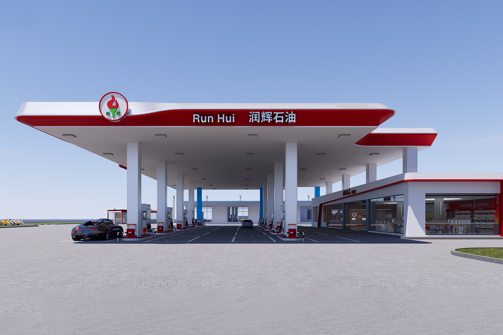
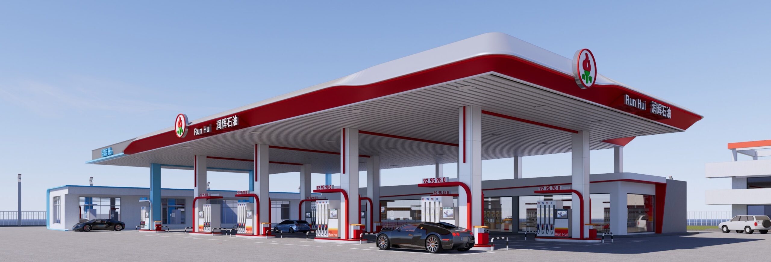
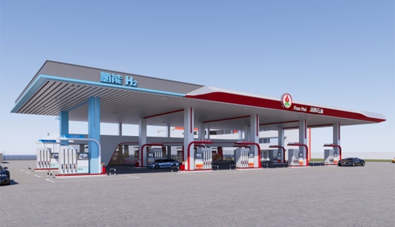
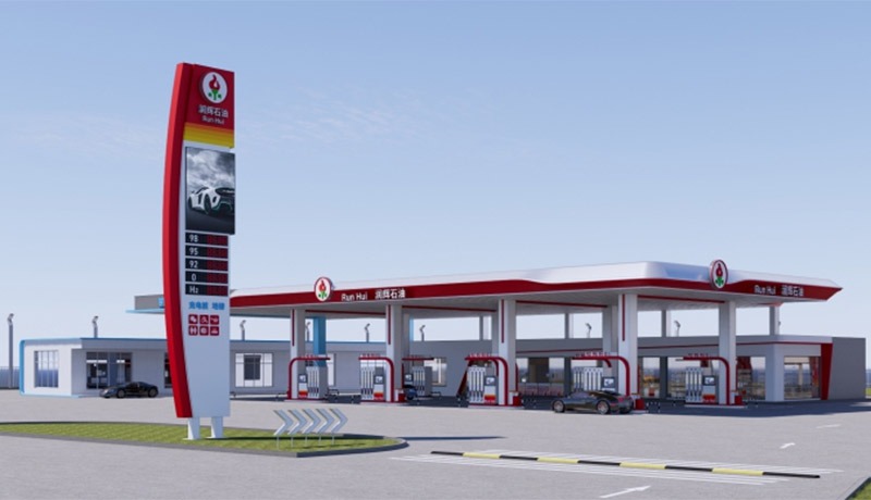
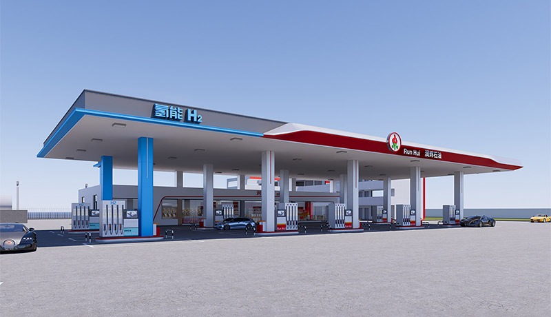
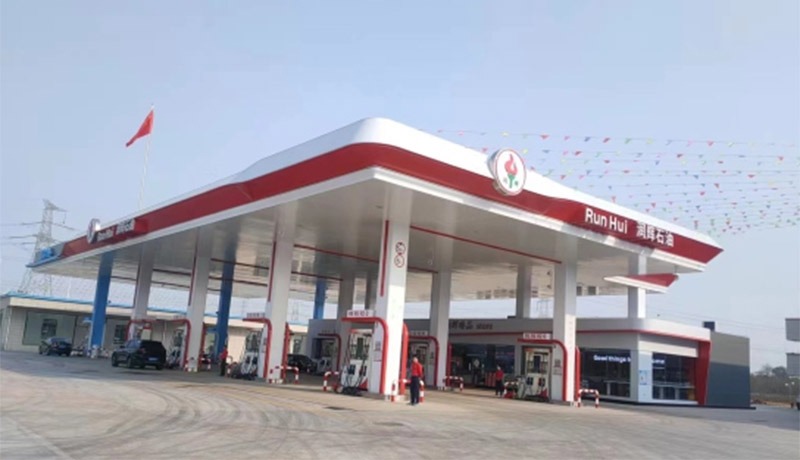
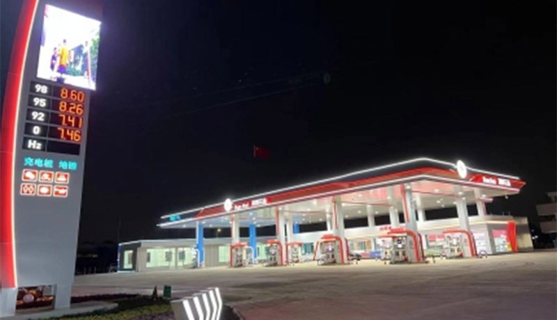
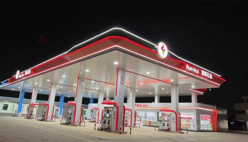
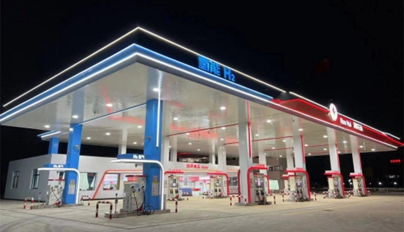
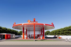
Design Concept: Red Charm, Brilliant Emblem, Building an Urban Energy Port
Project Location: Hongling Road, Nanhai District, Foshan City, China
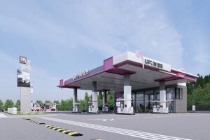
Design color tone: Red + White +Dark Gray + Petrified Blue
Project area: 800 ㎡
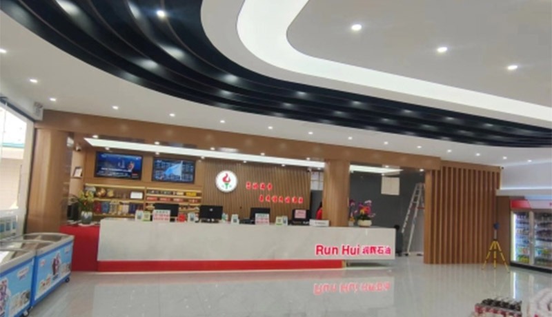
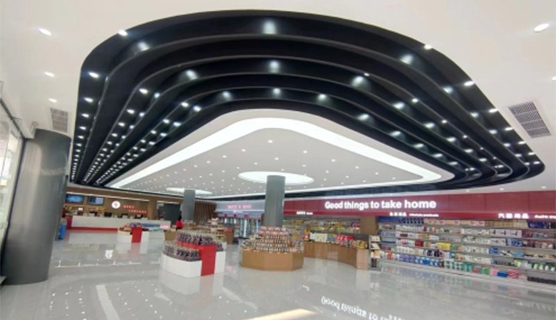
Project Content: pylon sign + Cornice + Soft Ceiling + Convenience Store + Column Covering + Car Wash Equipment

Flame Symbol, Empowering The City

Brand Logo

Runhui Petroleum’s flame-shaped logo is the soul of the design. In Foshan, a manufacturing hub, the flame symbolizes the energy of industrial advancement, a perfect match for the “power driving forward” nature of petroleum. The logo is primarily red and white. Red echoes the vibrant energy of Foshan’s lion dance, conveying the brand’s commitment to passionate service; white symbolizes pure energy, anchoring its commitment to “high-quality supply.”
From the canopy to the columns, and finally to the towering brand pillars, the logo is repeatedly reinforced, making “Runhui” a highly recognizable energy symbol on city streets. From afar, drivers can sense the power of continued growth.

imgi_4_runhui-petroleum-gas-station-8 imgi_3_runhui-petroleum-gas-station-9 imgi_11_runhui-petroleum-gas-station-1 imgi_10_runhui-petroleum-gas-station-2 imgi_9_runhui-petroleum-gas-station-3 imgi_8_runhui-petroleum-gas-station-4 imgi_7_runhui-petroleum-gas-station-5 imgi_6_runhui-petroleum-gas-station-6 imgi_5_runhui-petroleum-gas-station-7
Simple and Powerful, Adapted to the Local Environment

Architectural Form

The exterior form follows the principle of “simple yet powerful.” The flowing curves of the canopy echo the “swinging and light” rhythm of Foshan’s Lingnan architecture, mitigating the harshness of the industrial facility. The red and white color scheme maintains the striking characteristics of the energy industry while also incorporating Foshan’s urban color palette (e.g., the red walls of the arcades and the white sails of the dragon boats).

The towering brand pillar, like a city beacon, integrates fuel prices and service information. It serves as an efficient signpost during the day and transforms into a luminous sign at night, outlining the distinctive “Runhui” silhouette against the city skyline. The gas station seamlessly blends into Foshan’s streetscape, becoming a modern statement of the region’s character.

A Coexistence of Order and Warmth

Spatial Atmosphere

he exterior design balances functional order with a humanistic warmth. The gas station’s lanes are clearly planned, with white markings creating a safe and orderly traffic flow, in line with Foshan’s urban rhythm of “efficiency first.” The digital screens and service icons on the brand pillars convey a sense of technology and convenience, allowing drivers to find a balance between “efficient refueling” and “humanistic care.” This upgrades the gas station from a simple energy station to an “energy transfer station” that transmits the warmth of the city, embodying Runhui Petroleum’s brand philosophy of “Your satisfaction is my eternal pursuit.”

Completed Project Photos

Contact Us
Scroll to Top