Gaosheng Petroleum Gas Station
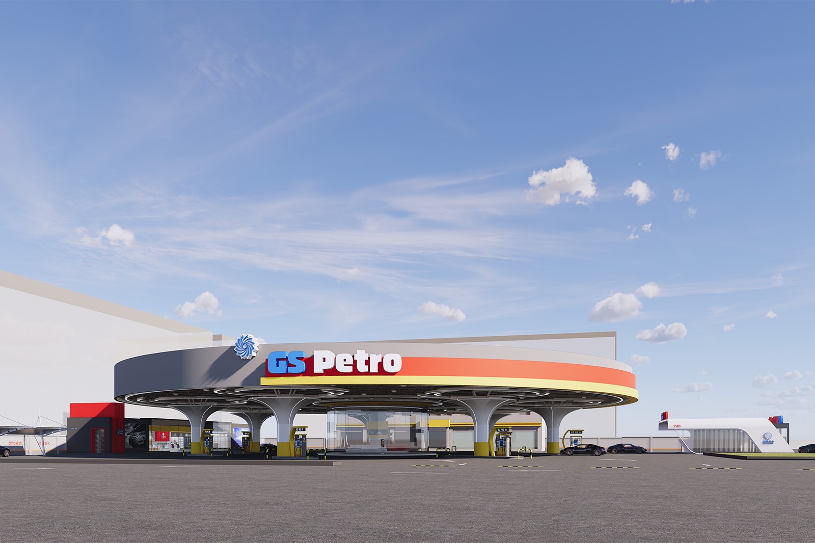
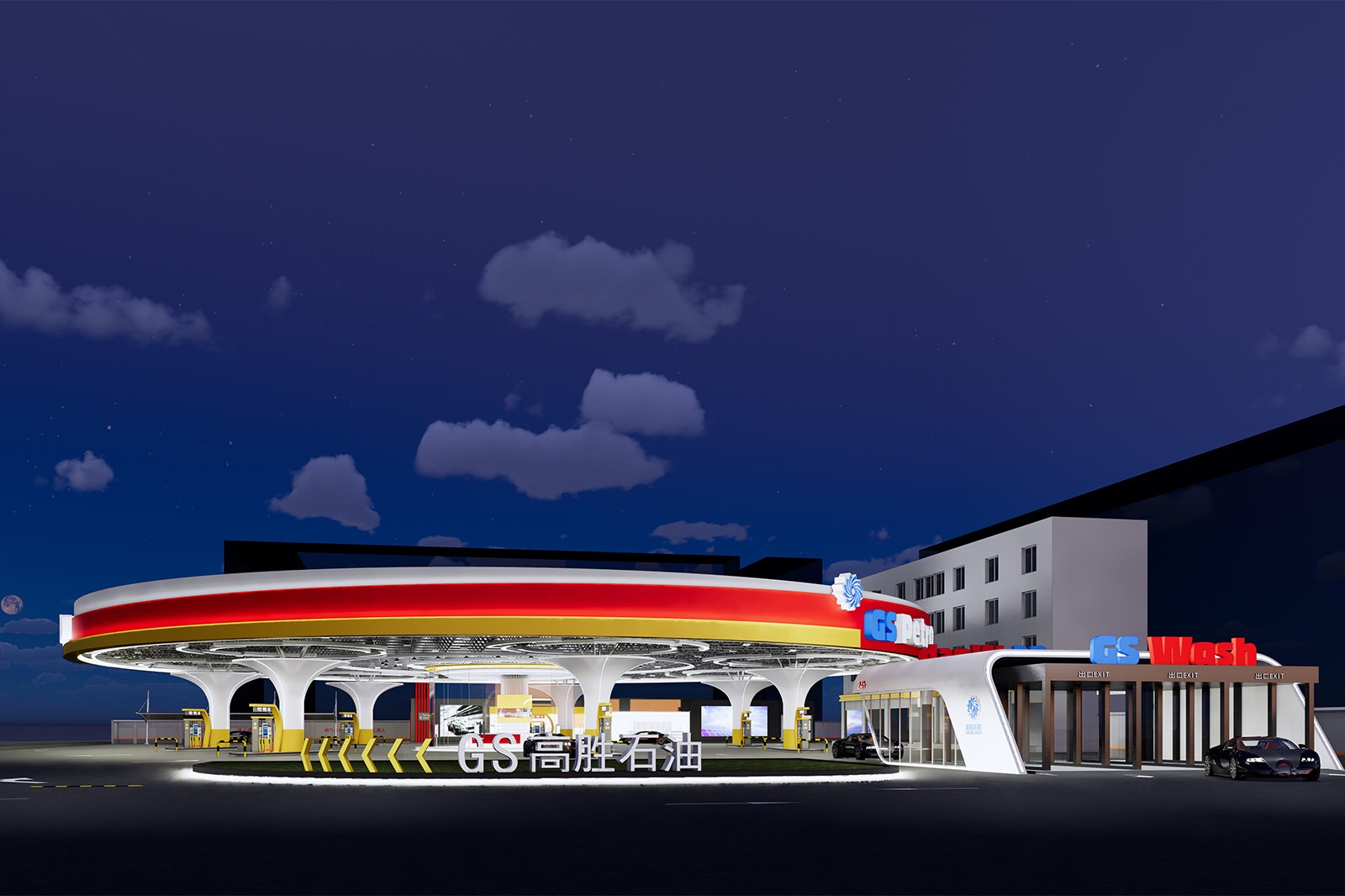
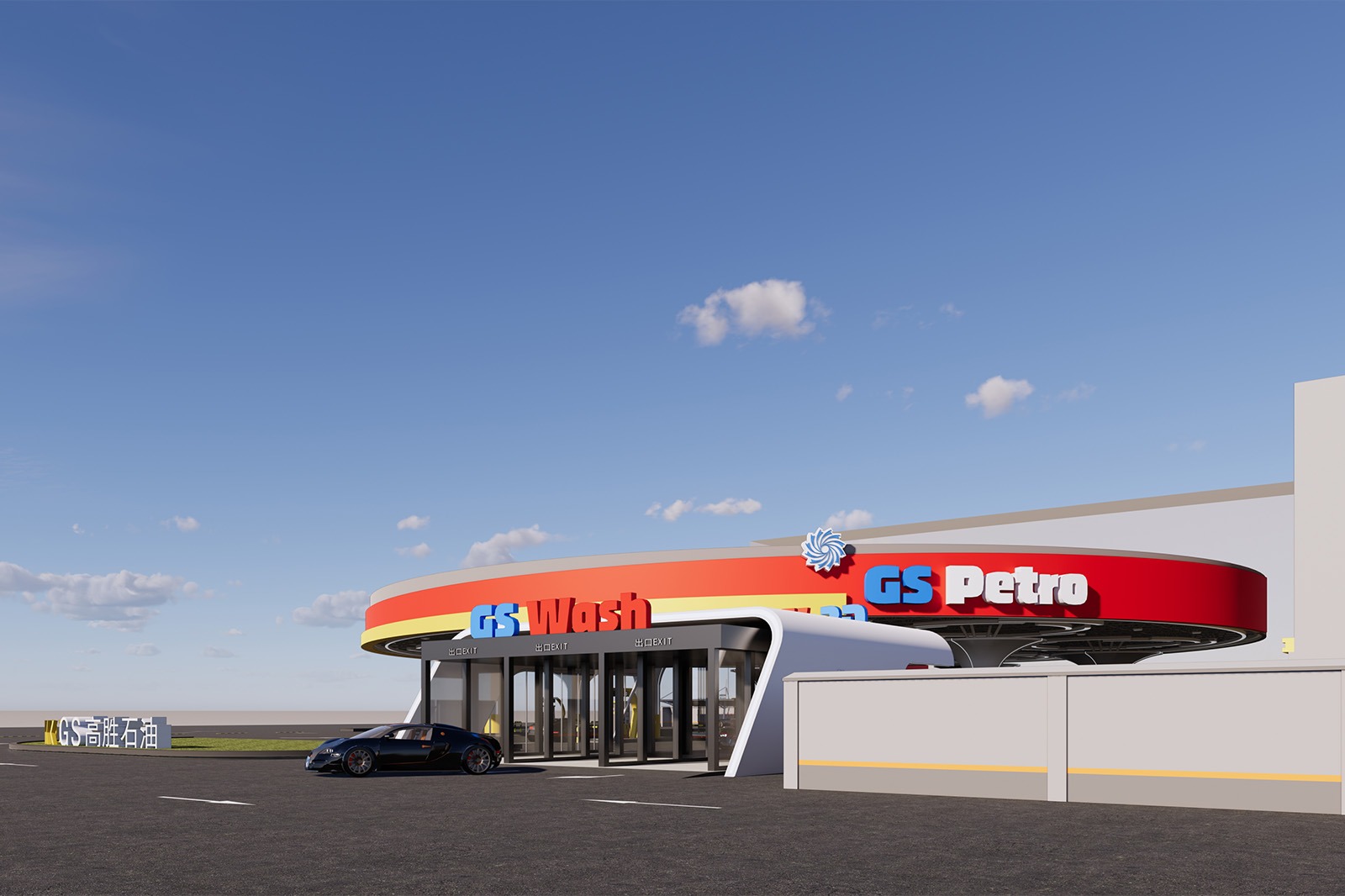
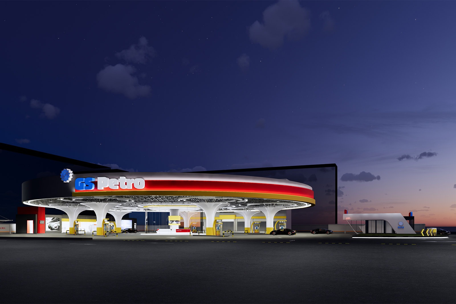
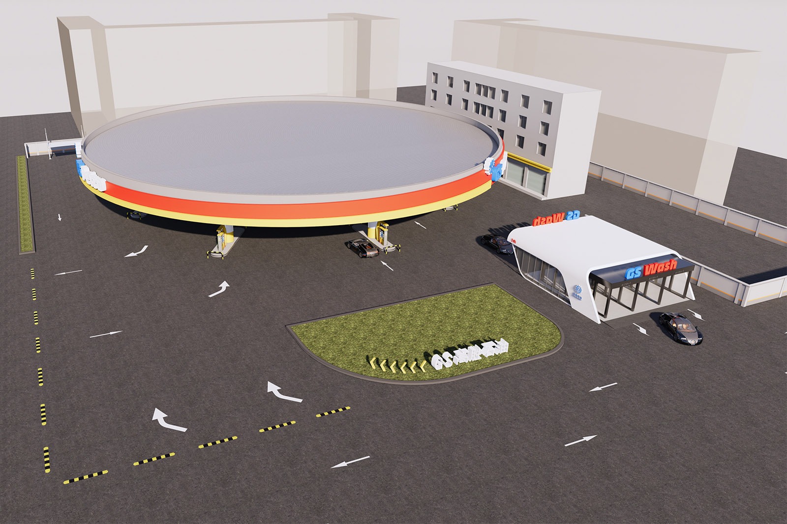
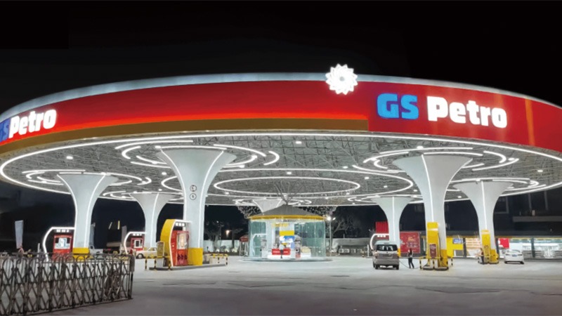
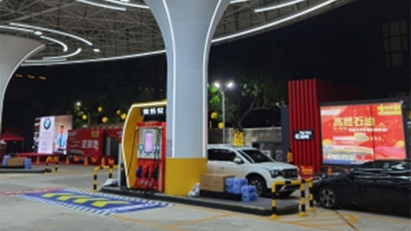
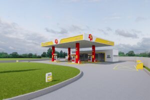
Project Location: Simapu Town, Chaonan District, Shantou City, Guangdong Province, China
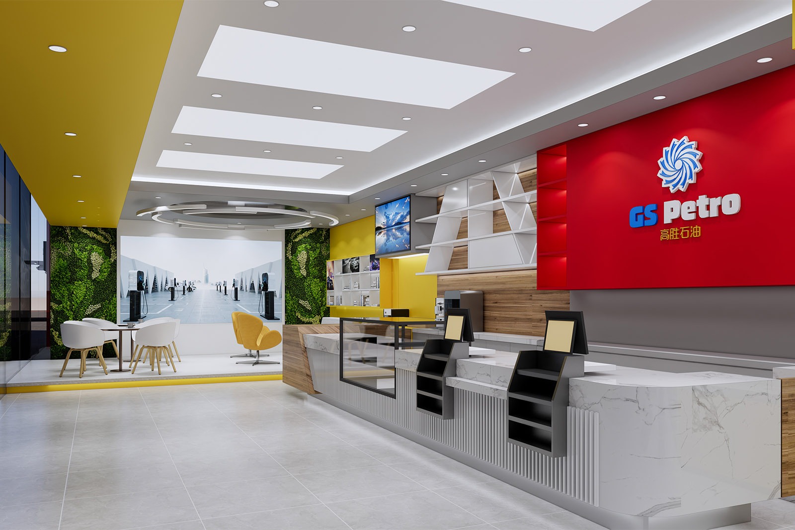
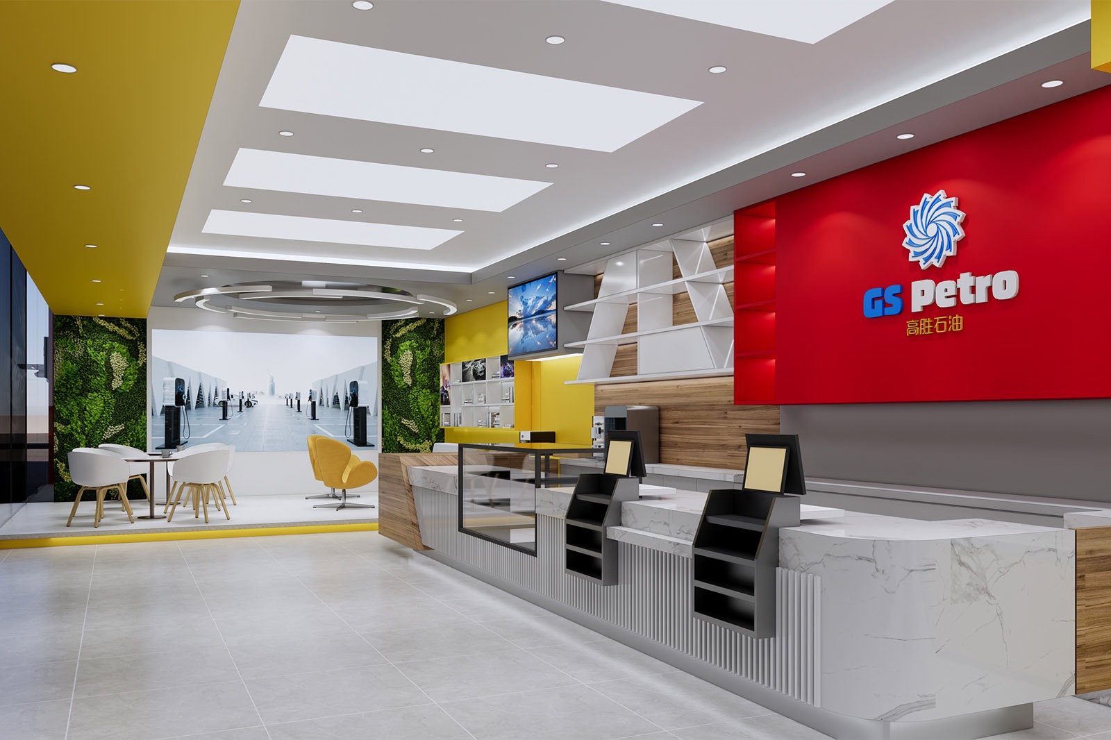
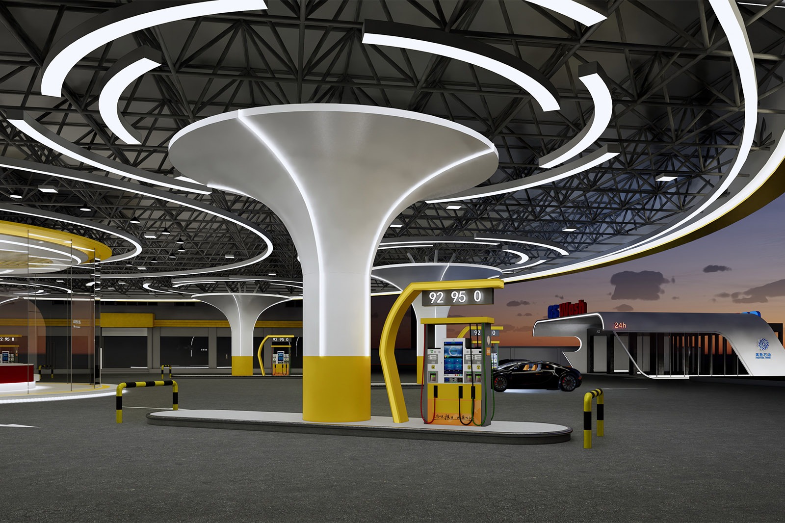
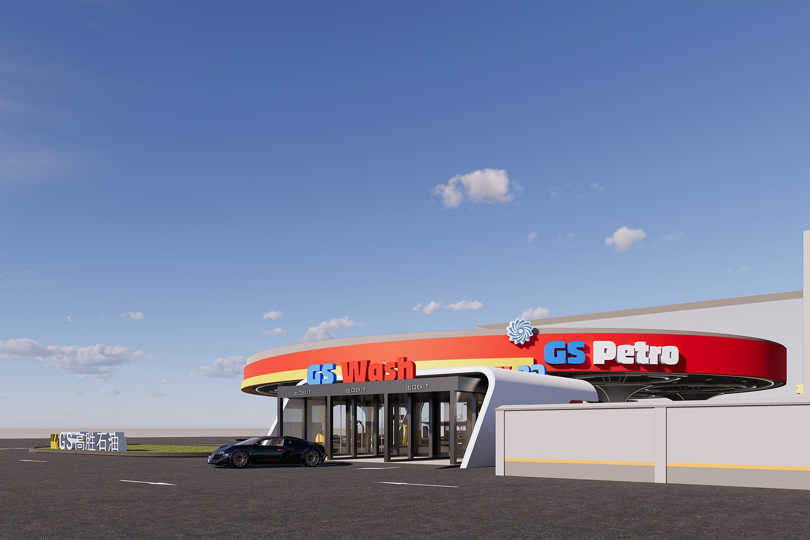
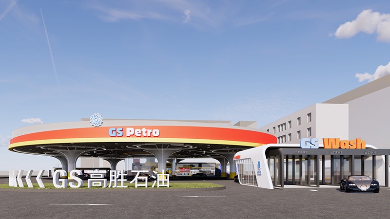
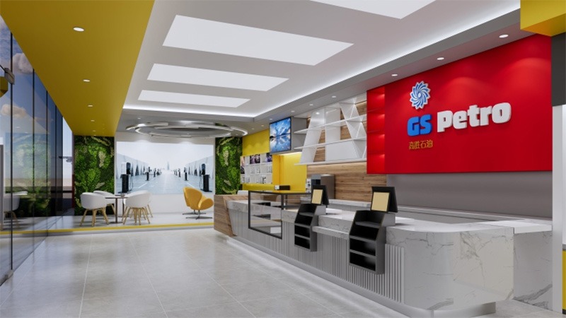
Design color tone: Pure White + Cool Gray +China Oil Red
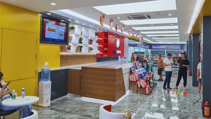
Project area: 800 ㎡
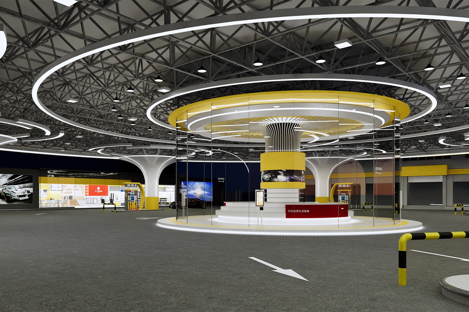
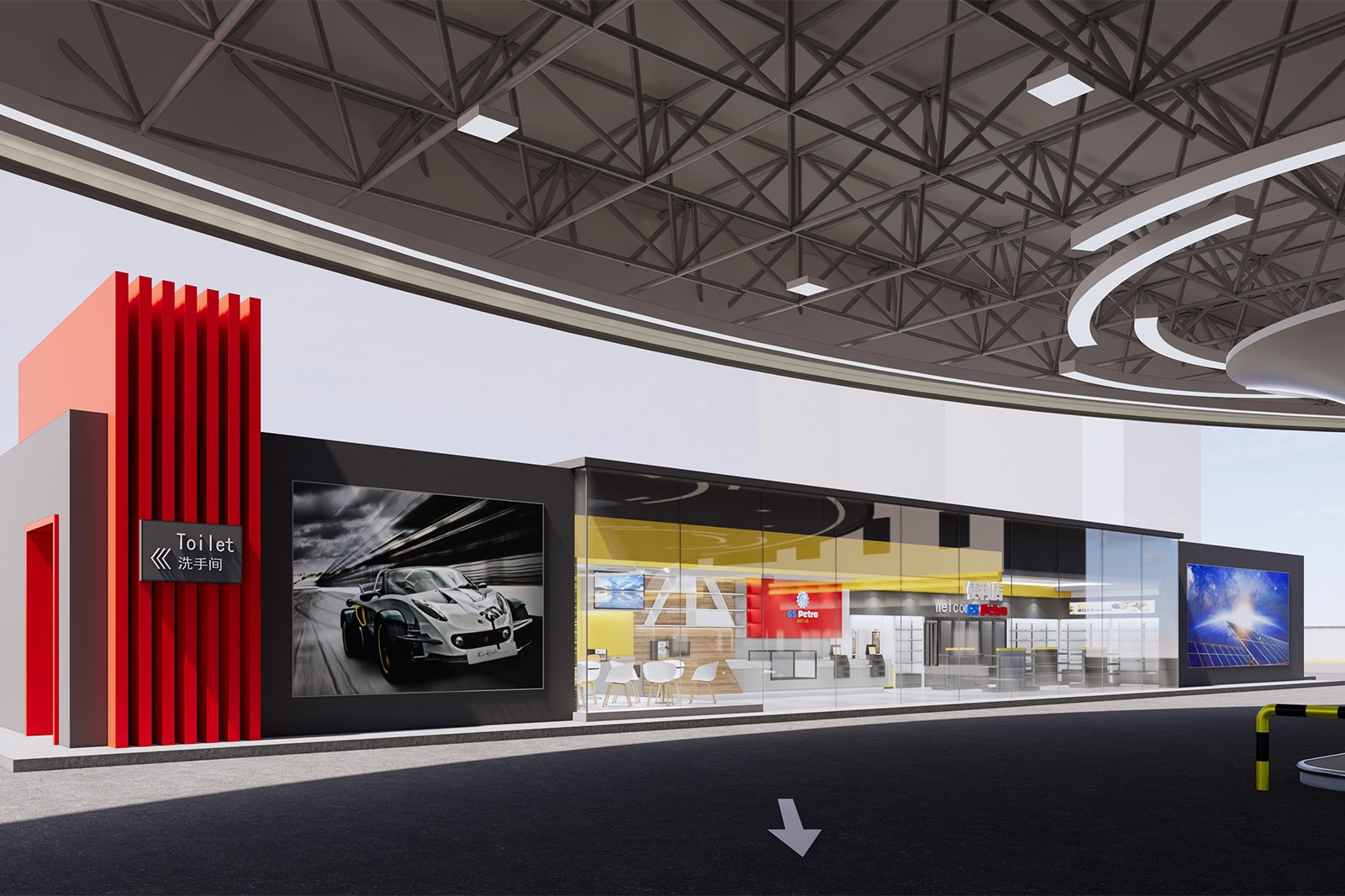
Project Content: canopy singboard+canopy fascia + convenience store + column wrapping + soft film ceiling + entrance and exit signs
Design Concept of Gaosheng Oil Gas Station: Turbine Empowerment, Victory Starts a New Journey
Leave Your Message
Visual Decoding of Power Gene
Turbine Symbol
The abstraction of turbine as the core logo is an accurate decoding of the energy attribute of “HIGH OIL WINS”. The dynamic form of the turbine rotation not only echoes the core power source of the fuel vehicle engine, but also implicitly coincides with the future trend of “energy circulation” in the new energy era. The combination of red, yellow and white colors, with the warm background of the oil industry and the visual tension of technology, makes the turbine symbol the “energy totem” of the gas station, conveying the brand proposition of “injecting potential energy into the engine and giving confidence to the journey” in the Shantou skyline.
Scene Extension of Turbine Logic
Spatial Narrative
Vehicle Flow Line: Turbine Circulation
The circular canopy constructs a “turbine-level” efficient flow line – vehicles are like the energy flow on the turbine blades, naturally entering, flowing smoothly, and quickly replenishing. This design breaks the linear layout of traditional gas stations and adapts to the traffic rhythm of Shantou as a transportation hub with a spatial logic of “circulation without stagnation”, making the refueling process a “power relay” and interpreting the operational philosophy of “efficiency is competitiveness”.
Functional layout
orderly reorganization of energy modules The refueling island, smart equipment area, and supporting service area are like the precision components of a turbine. They are reorganized around the concept of “fast supply + diversified services”: the refueling area focuses on “energy injection efficiency”, and the supporting area extends derivative services such as “car washing and rest”, allowing the gas station to evolve from a “single supply station” to a “travel energy station”, responding to the needs of car owners for “one-stop energy services” and building an interactive ecosystem of “people-car-station”.
Gaosheng Petroleum Gas Station
Brand resonance
The value transmission of the turbine spirit The “breaking boundaries and continuous evolution” symbolized by the turbine deeply resonates with the urban spirit of Shantou – this pioneering coastal city is embracing energy reform with an open attitude. Gaosheng Petroleum utilizes turbine elements to convey its brand message of “maintaining its core mission of energy supply while exploring a green energy future.” The red and yellow tones evoke the values of traditional energy, while the turbine shape implies a yearning for the new energy era. This transforms the gas station into a powerhouse that “connects the past and the future, driving the city forward,” embodying Gaosheng’s brand vision of “More than just fuel, but an energy partner.”
From visual symbolism to spatial experience, from functional fulfilment to value resonance, the turbine element permeates the design throughout, transforming the Gaosheng Petroleum gas station into not only a physical energy refueling point but also a city landmark that embodies the spirit of power, instilling confidence and energy for success in every journey for Shantou drivers.
Related products
Related products
-
Gas Station
Hongcheng Petroleum Gas Station
-
Gas Station
Lemon Petrochemical Gas Station
-
Gas Station
Haru Petroleum Gas Station


