Lemon Petrochemical Gas Station
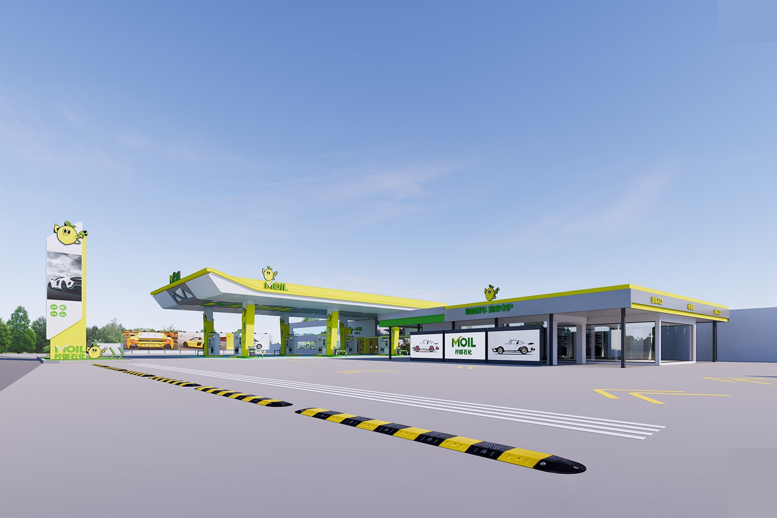
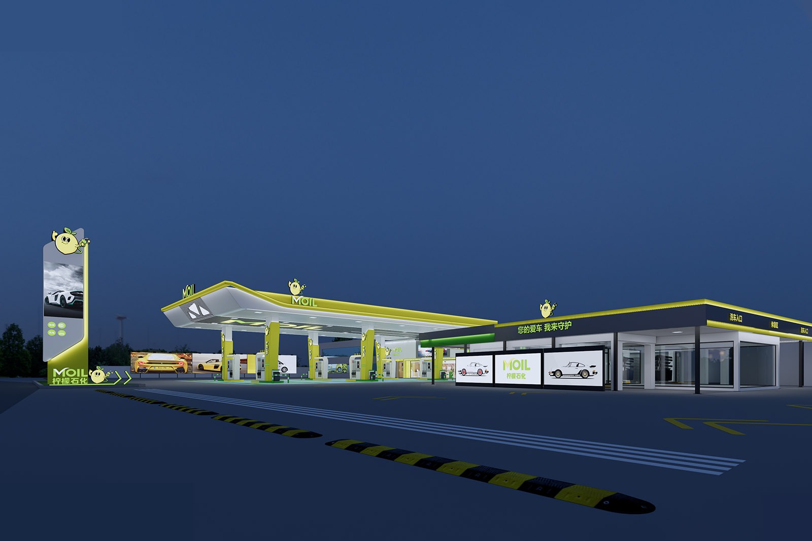
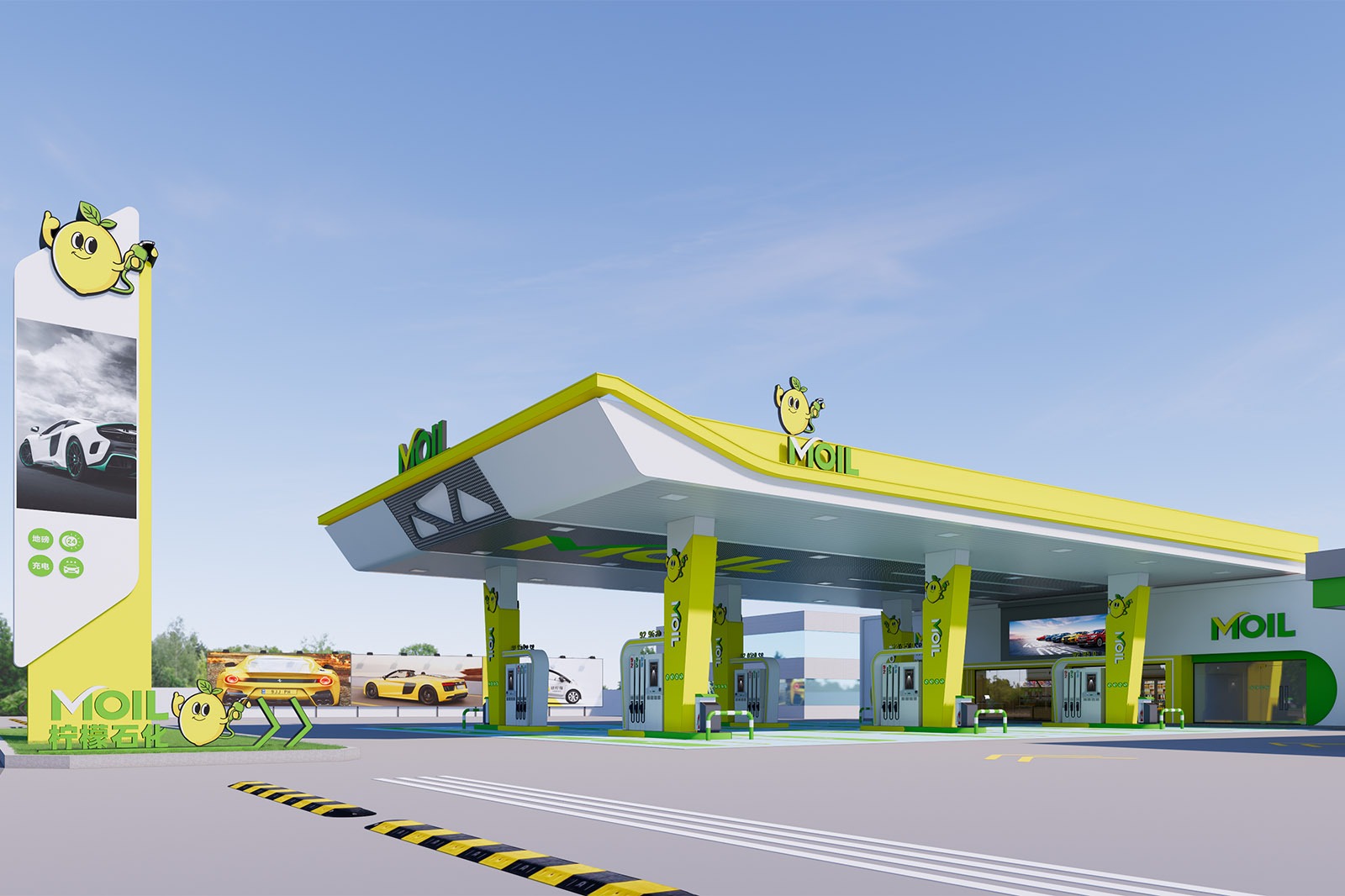
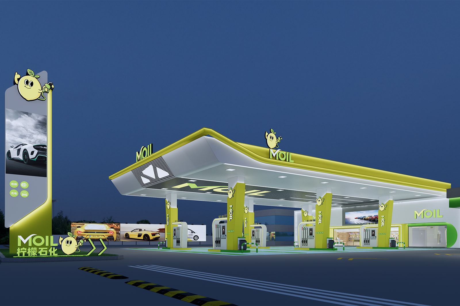
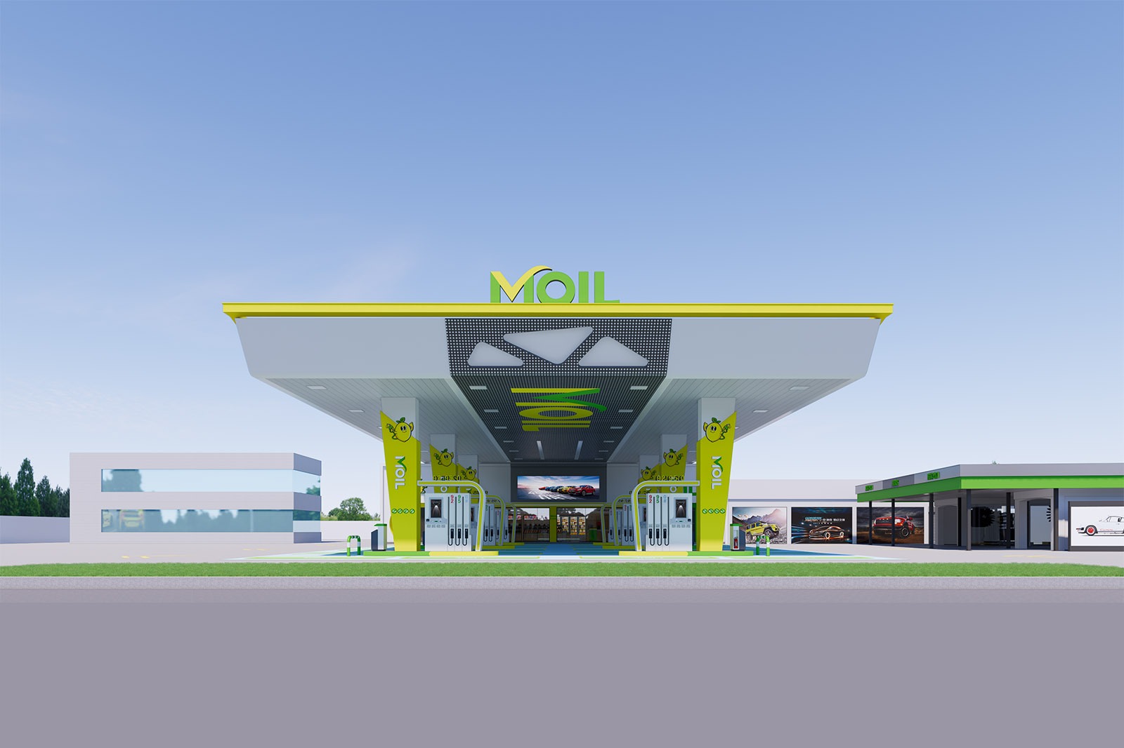
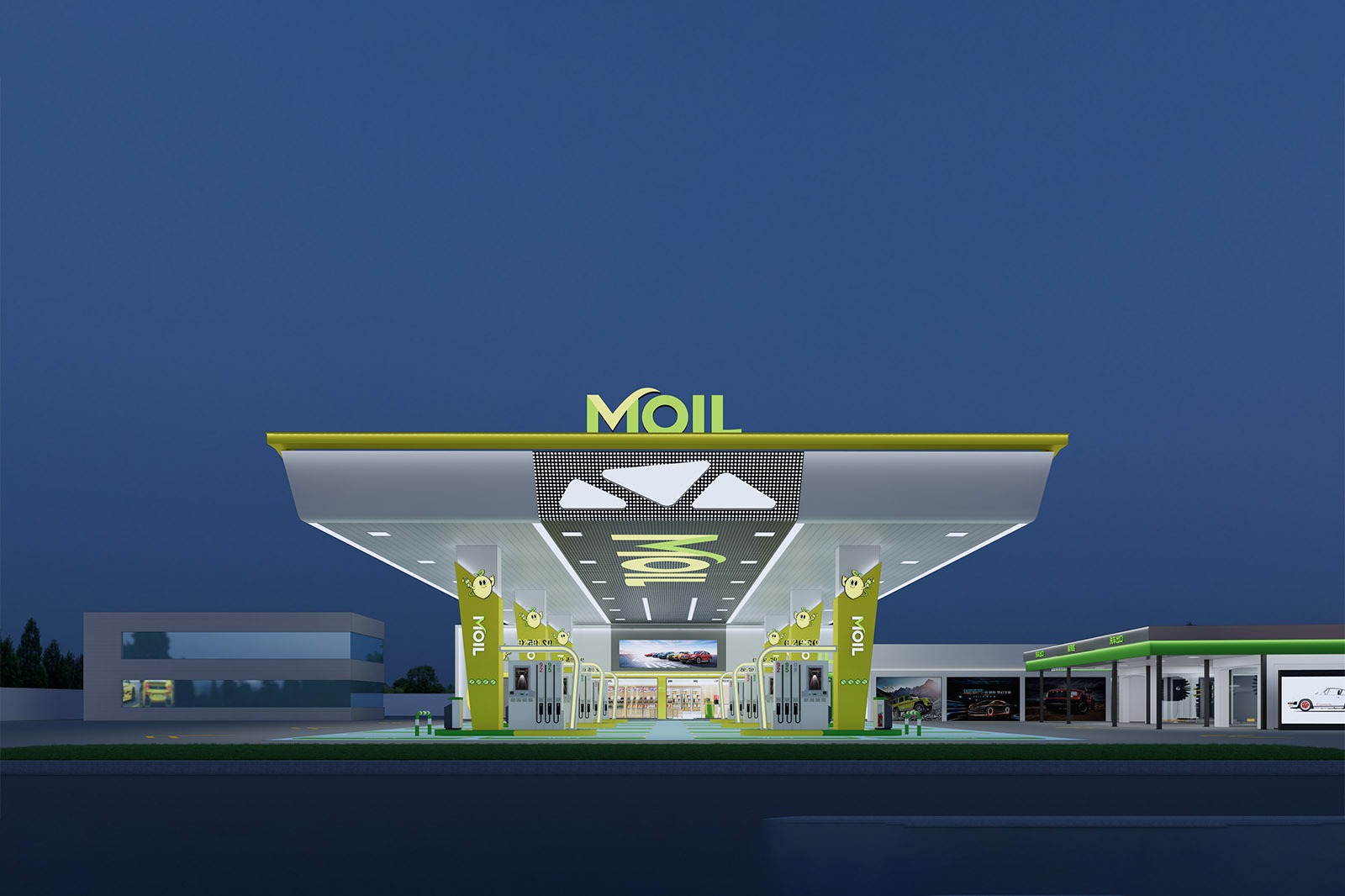
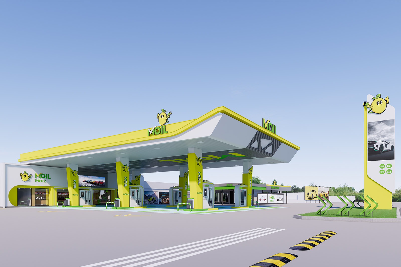
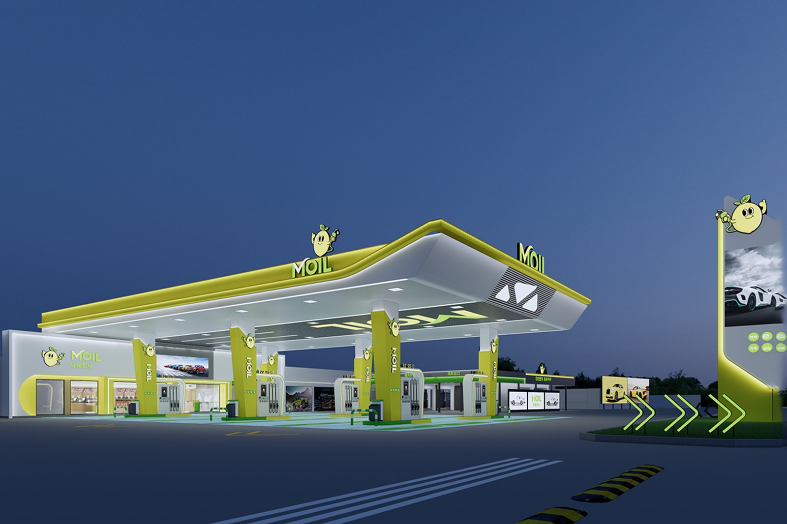
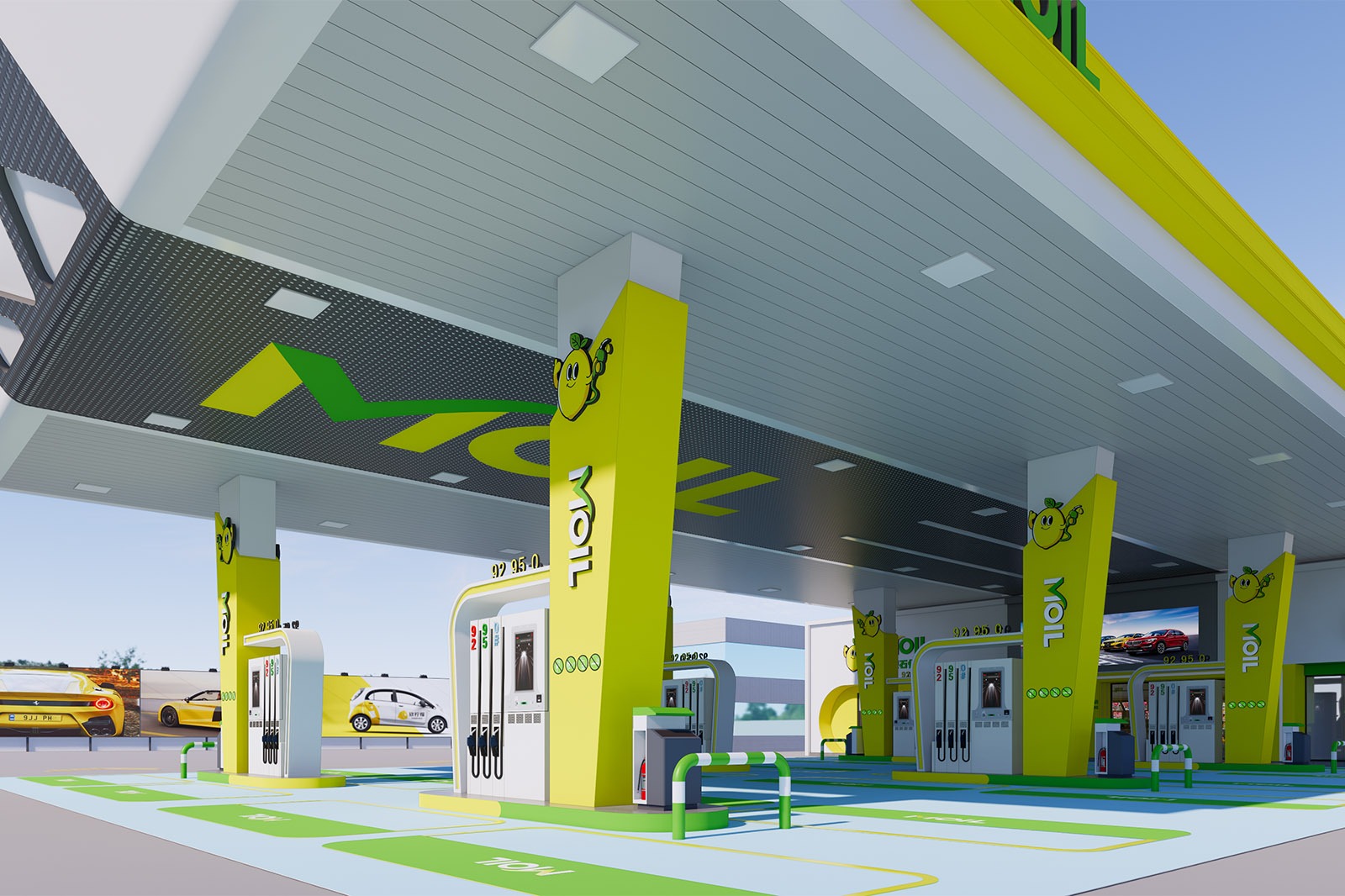
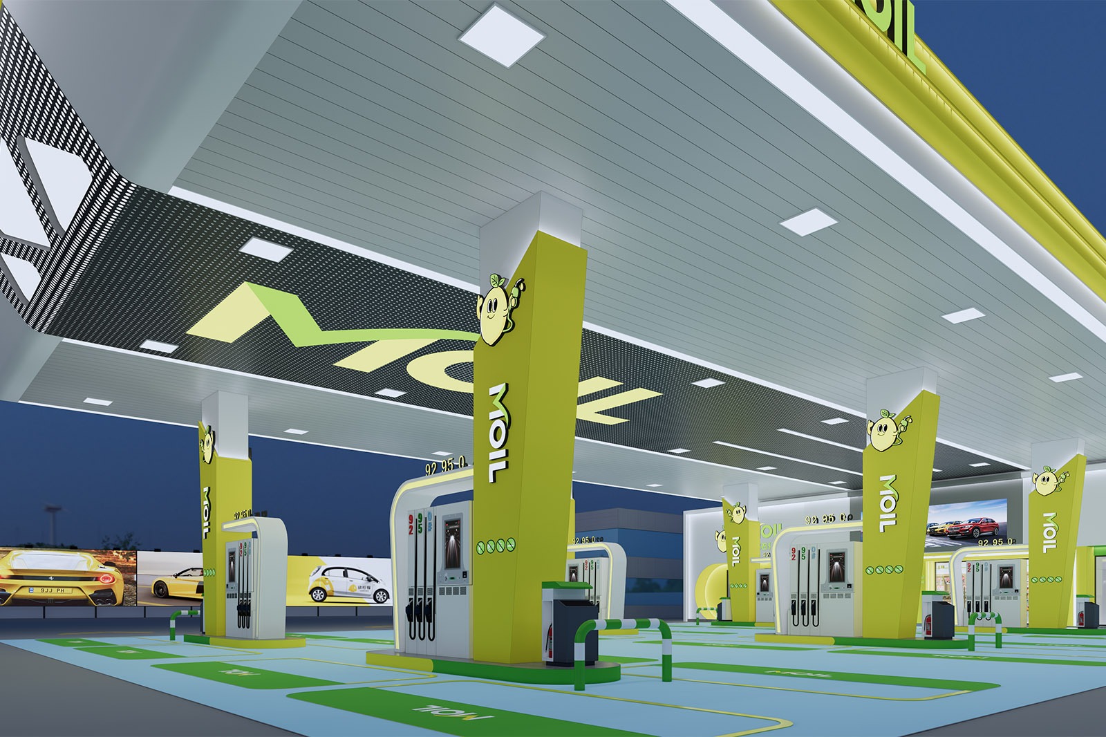
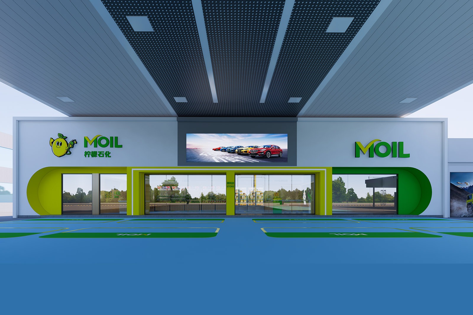
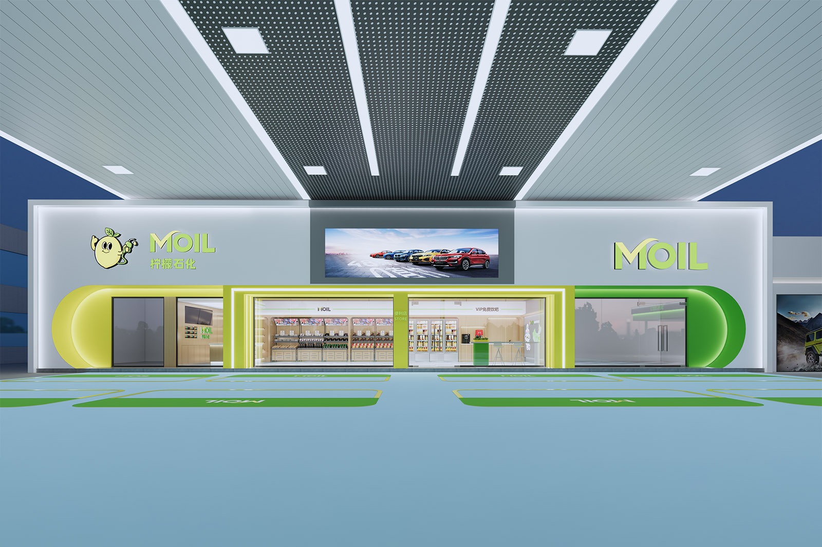
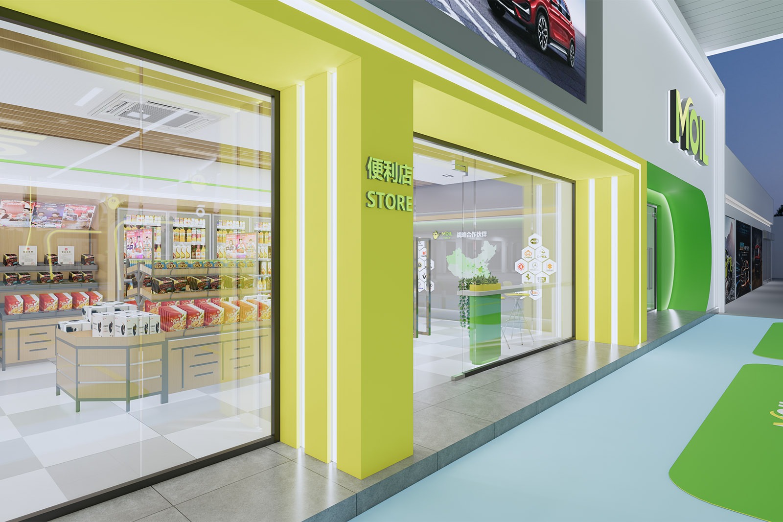
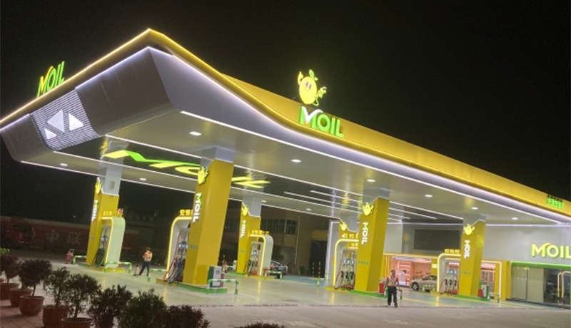
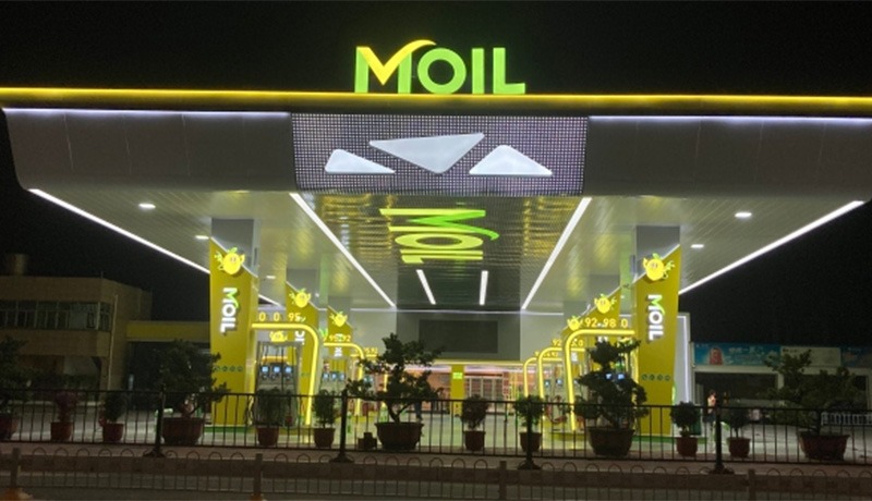
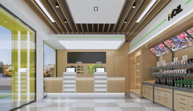
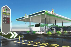
Design Concept: Vitality Engine, Green Station
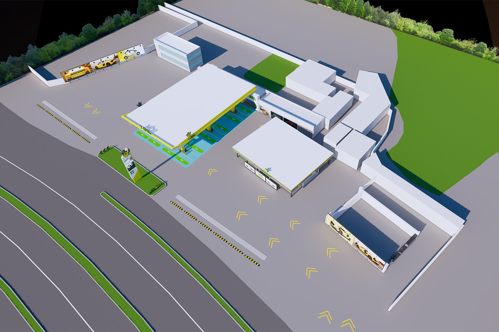
Project Location: Kengweiyang Lemon Petrochemical, Mianhua Village, Haojiang District, Shantou City, Guangdong, China
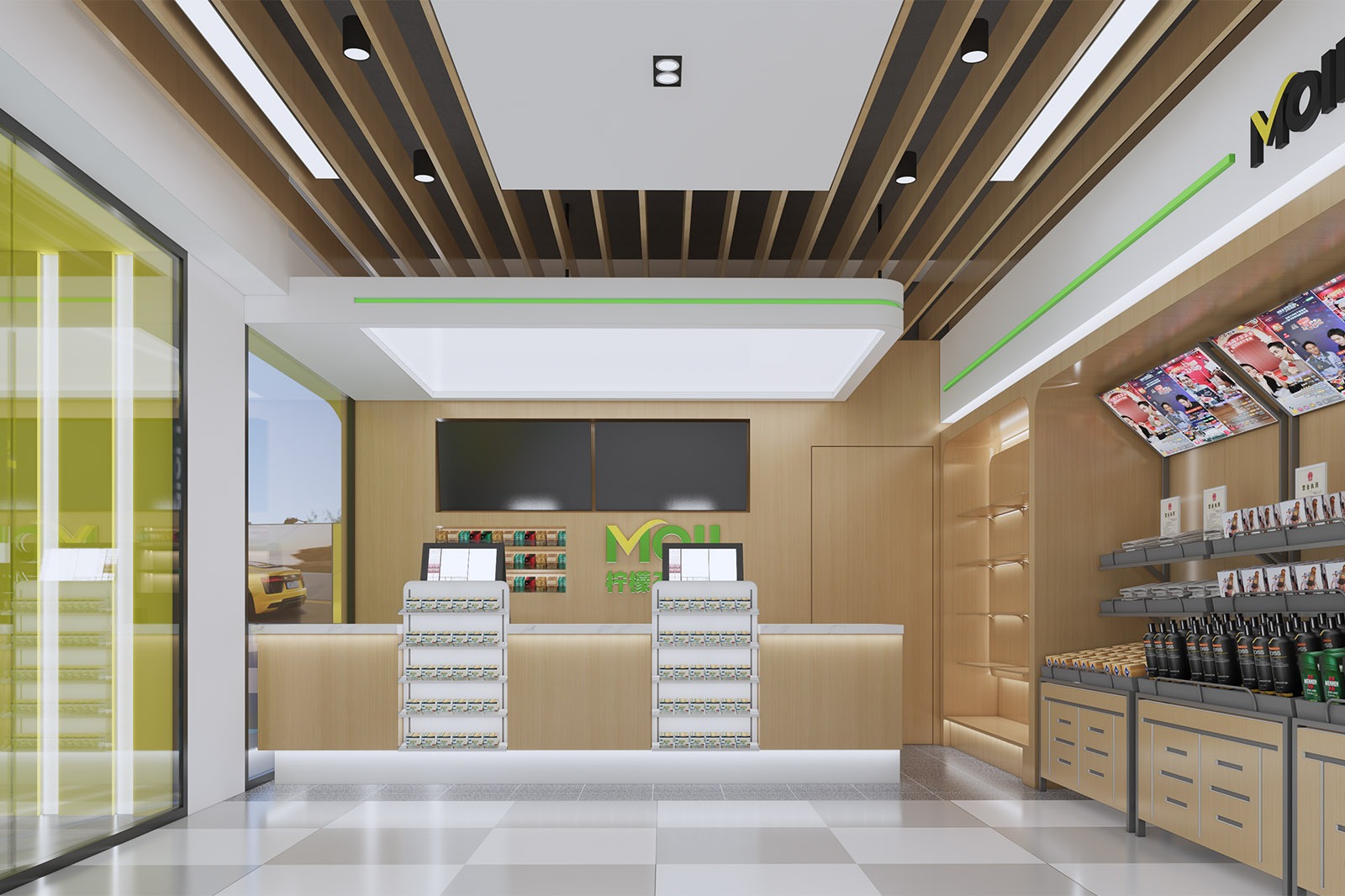
Design color tone: Lemon yellow +Light green + pure white
Project area: 700 ㎡
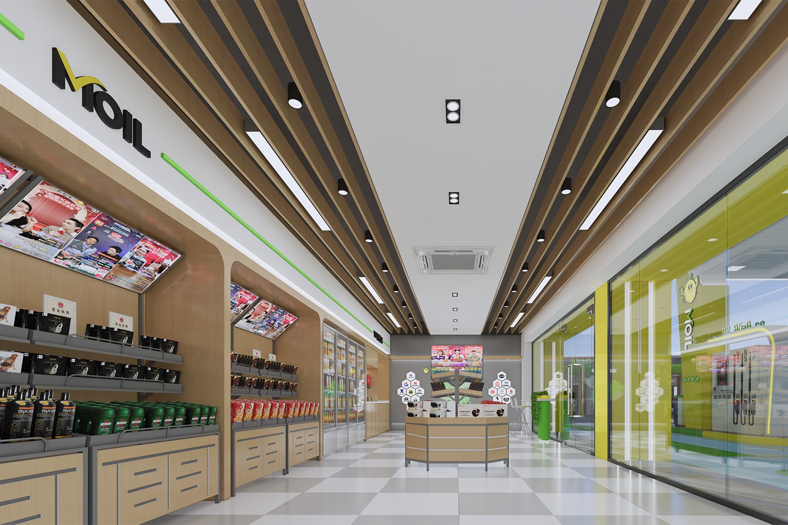
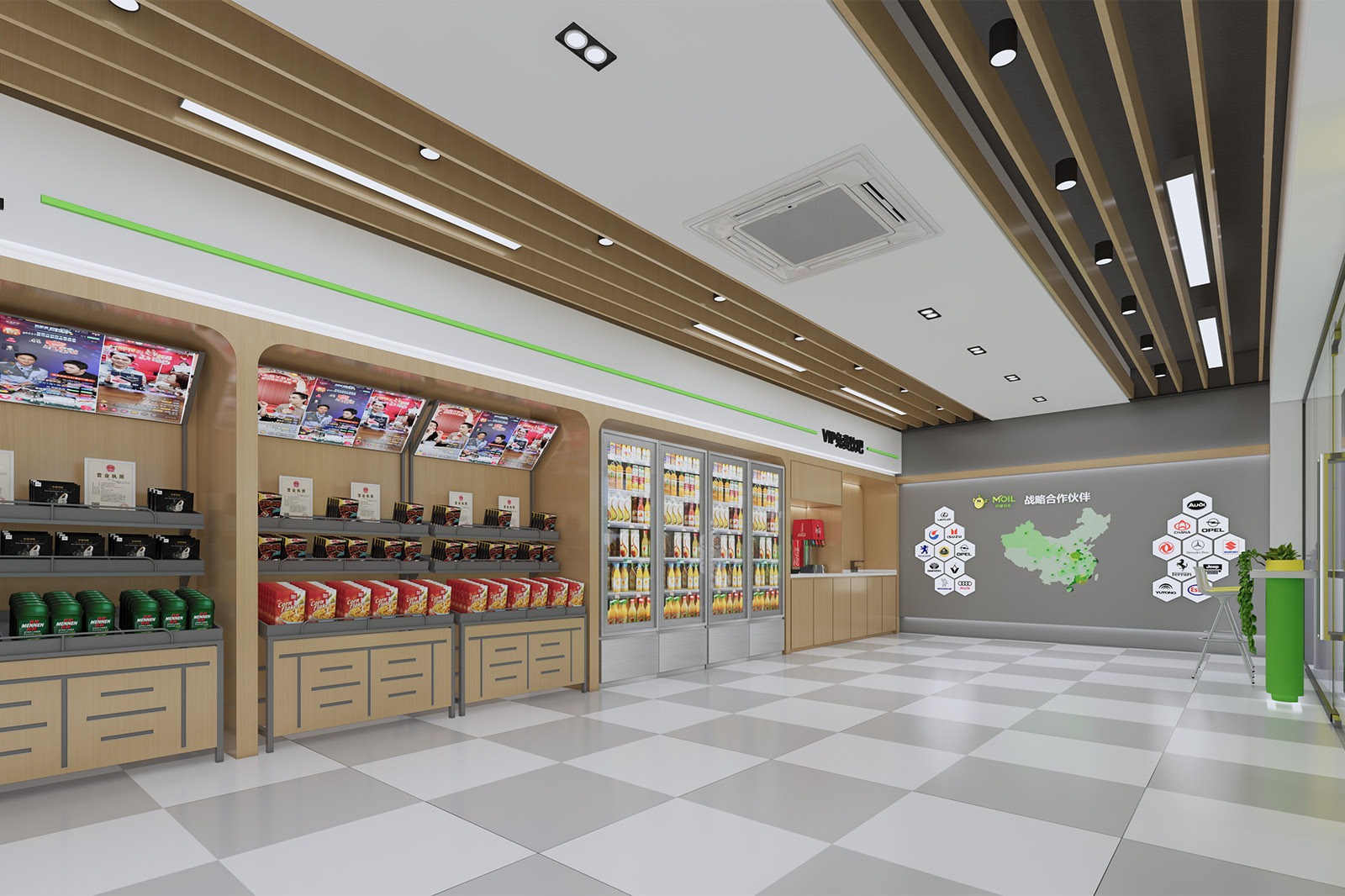
Project Content: Cornice + soft film ceiling + convenience store + column wrapping + Car Wash Equipment
On a road trip, the founder witnessed a sour lemon transformed into refreshing juice by sunlight, akin to energy empowering the journey. Shantou is rich in lemons, and their refreshing and uplifting qualities align with the company’s vision of “injecting vitality into travel.” Therefore, the company chose “Lemon Petrochemical (MOIL)” as its brand, aiming to incorporate this vitality into fuel supply, allowing drivers to rekindle their passion for the journey with every stop.
Leave Your Message
Sunshine-Like Brand Symbols
Visual Vitality
A bright lemon yellow as the primary color scheme, complemented by white and green, creates a highly recognizable visual identity. The adorable lemon cartoon character personifies the brand—born from the Chaoshan residents’ desire for “energizing companionship.” Like an ever-enthusiastic companion, it leaps from the brand pillars to the canopy, brightening drivers’ journeys with sunshine-like colors, making the gas station a vibrant symbol on the city’s roads.
Sunshine-Like Brand Symbols
Green Technology
Green elements represent the brand’s commitment to sustainability. Inspired by the Chaoshan people’s commitment to protecting their local ecology, the green lines within the station resemble natural veins, connecting environmental protection concepts with technological services.
Modern refueling equipment and intelligent information displays not only meet the demand for efficiency but also underscore the ambition of “exploring green energy.” Just as Chaoshan’s ancestors pioneered the red-headed boat trade, Lemon Petrochemical now uses technology as a guide to practice ecological symbiosis in its energy supply, allowing drivers to experience the brand’s environmental responsibility while enjoying the convenience.
A Warm and Comfortable Stop on the Journey
Experiencing the Original Intention
The spatial planning embodies the original intention of “customer first.” The rational refueling route and clear information display respect drivers’ efficiency. The lively colors and cartoon-themed atmosphere embody the Chaoshan people’s tradition of “treating guests with affection.” Transforming the gas station into a journey stop, the moment spent waiting to refuel can be a warm and comforting respite from travel fatigue, like returning to a familiar Chaoshan hometown, surrounded by warmth and care. Lemon Petrochemical becomes a cherished energy companion in drivers’ memories, bringing the warmth of home.
Related products
Related products
-
Gas Station
Runhui Petroleum Gas Station
-
Gas Station
Gaosheng Petroleum Gas Station
-
Gas Station
Hongcheng Petroleum Gas Station
-
Gas Station
Haru Petroleum Gas Station


